For whatever reason Edinburgh has never been a natural home for visual art. The city, as the gurning flyposted faces of a thousand comics and cabaret acts can attest, has typically had other cultural concerns. The Edinburgh Art Festival, now in its tenth year, which opened last week concurrently with the Edinburgh Festival and the Fringe, has always been slightly held in the shadows. Not just by its municipal cultural bedfellows, but also the strength of neighbouring Glasgow’s art scene – and that city’s own jamboree, Glasgow International. Edinburgh’s answer has, in previous years, seemed bitty and without focus – a multitude of public commissions but nothing particularly biting for these to pivot round. This year however the organisers have scored a headline act, and the festival is the better for it.
A smashed Stag beer bottle discarded in the bottom left corner loosens the entire composition
Peter Doig’s retrospective at the Scottish National Gallery was an fervidly enjoyable affair that succeeded in showcasing just how much a formalist a painter the Edinburgh-born, Trinidad-based artist actually is. Part of the credit for this must go to the show’s curators, who quietly, and without self-aggrandising fanfare, stitched together a strong narrative through which the visitor can negotiate the exhibition with. The first room was dedicated to focusing the viewer’s attention on the underlying spatial – almost geometric – structure of Doig’s large, richly atmospheric, figurative works. In House of Pictures (Carrera) (2004) the canvas is horizontally divided intro three: a multicoloured brick wall separates a band of clear blue sky and an uneven ground of sand and weeds. In keeping with the sense of magical realism that pervades much of Doig’s work; four windows punctuate this outside wall, allowing the viewer to see the sea beyond. A smashed Stag beer bottle discarded in the bottom left corner loosens the entire composition, drawing in the viewer’s attention.
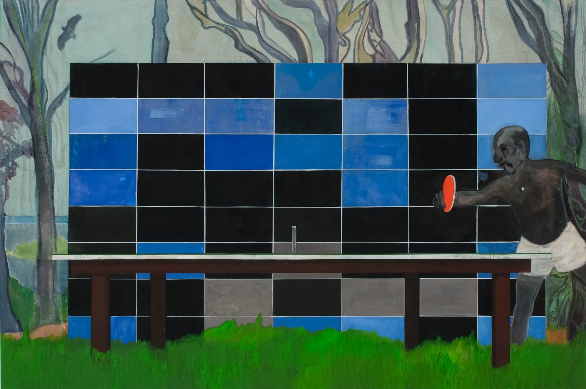
In the same room are four further works, together with various preparatory studies, each showcasing a similar spatial formality. The ping-pong table in Ping Pong (2004) is being played before a dominating block of blue and black rectangles – a wall of bottle crates perhaps, if one was desperate for depictive interpretation. In Maracas (2004), a ziggurat-style tower of soundsystem amps, flanked by two distant palm trees, purposely overfills the canvas. With this aspect of Doig’s work, something that I had overlooked previously, neatly demonstrated, one is given renewed perspective towards the rest of the exhibition.
Pelican (2004) and Pelican (Stag) (2003), two of Doig’s best-known works, can now be viewed through this prism of formal image construction for example. Where once, in my mind, the paintings were just images, albeit ones full of mystery and verve, of a topless man striding from the right to the left of the canvas (in Pelican, the overall scene is a beach during sunlight hours; in Pelican (Stag) the man is passing a waterfall at dusk); what unites them now, asides the identical man, is the similarity in which the different landscape forms – shapes of paint – block out the space inside the work’s frame.
In the same gallery is Sea Moss (2004), Doig at his most sparse. A canvas, almost raw, depicts a beachscape in the barest of brown oil paint. A few rippling, horizontal, brush strokes suggestive of the sea, a palm tree painted to an almost exact right angle to the right of the canvas. Other works are much more richly detailed. Music of the Future (2002–07) shows a sea promenade; with subsequent exhibited paintings depicting enlarged details of this scene. The curators demonstrate the amount of effort that Doig puts into his draughtsmanship (it might be fair to say it does not come naturally), his stylistic debt to Manet, and his newer works, such as Cricket Painting (Paragrand) (2006–12), that go beyond this, utilising a vivid, almost fluorescent palette, making them far more delirious, nightmarish, concoctions than his earlier, dreamier, works.
A couch covered with a throw printed with the repeated motif of an ape’s sphincter
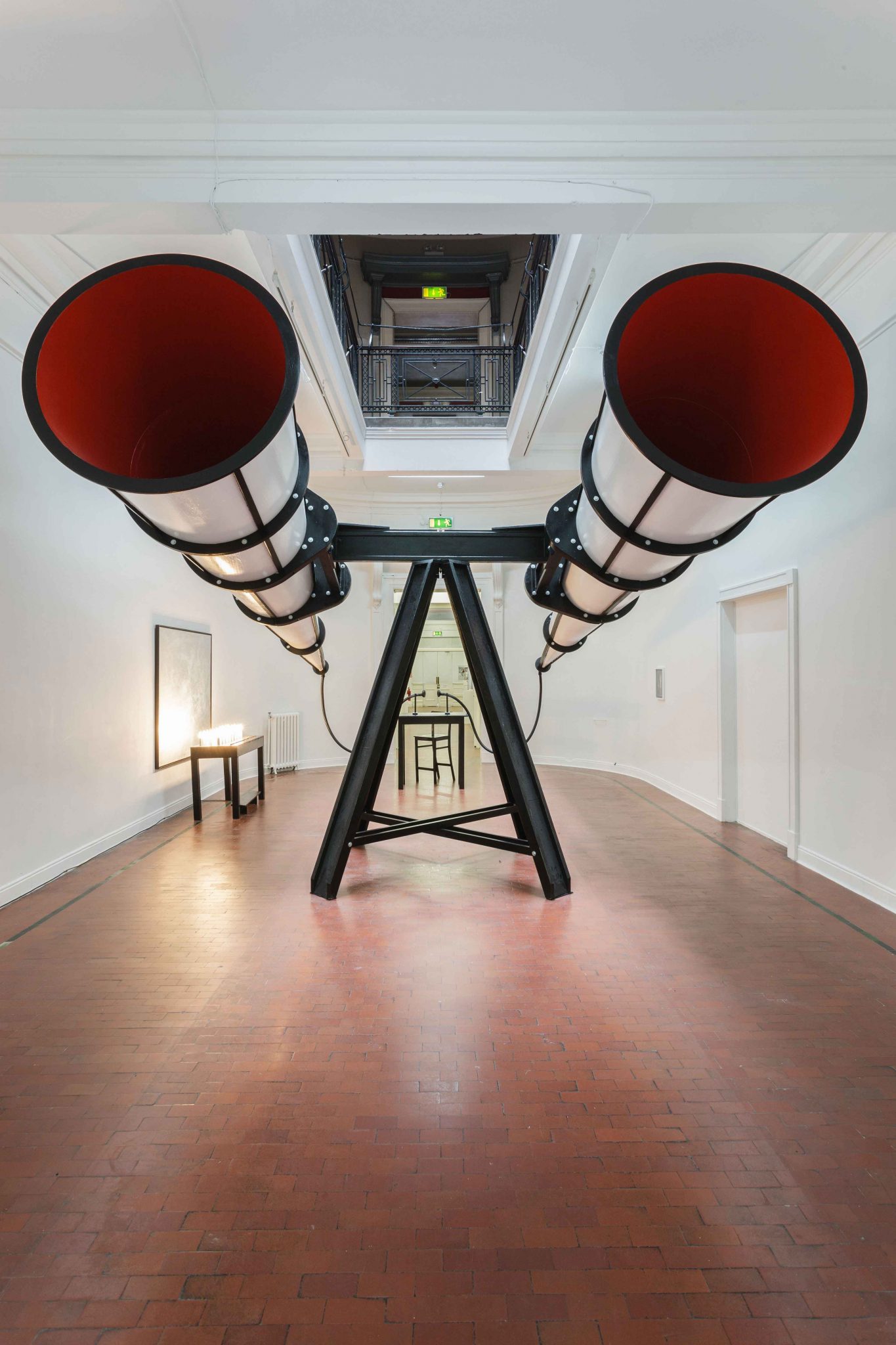
Elsewhere in the festival programme, new perspectives are sought on other familiar names. Inverleith House hosts a show of Franz West’s collaborations with other artists. Some of these are playful: West’s 2012 work with Marina Faust, Talk Without Words (Christopher Wool) for example, a large mohair ball hung on a cord over a table, with visitors invited to knock the ball to each other with their foreheads; or the artist’s venture with Rudolf Polansky, Siesta (2003), a couch covered with a throw printed with the repeated motif of an ape’s sphincter. Others are more unseemly: another work with Polansky, undated, in which a crude bar is set up, its Perspex top trapping a seemingly-liquid, semen-like, substance under it.
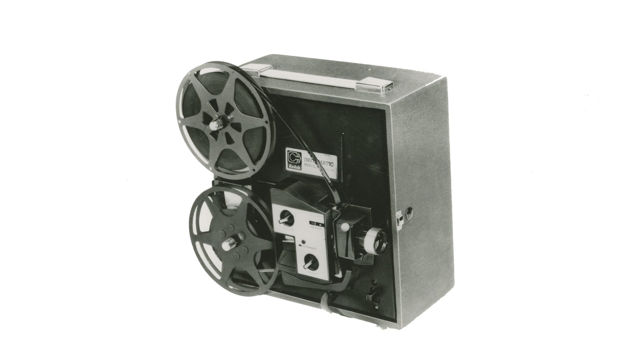
Summerhall, a vast mazelike space that takes pride in packing in as many shows as possible into its year-round programme, has staged an almost comprehensive retrospective of Lawrence Weiner’s editions projects – which range from penknives to bags to mugs. Each is handsomely shown in vitrines mounted on dark wood pedestals. The perversity of using this museological form to present practical objects sets up a welcome tension to the exhibition – asking the viewer to question the purpose and status of the objects in this particular strand of Weiner’s oeuvre.
‘Tension’ is one of those words that art critics like to use too much. It’s a way of saying (or perhaps hoping) that there could be an argument at play within a work or exhibition. Tension in a more common idiom, can also equate to awkwardness. There’s that type of social tension by the bucket load in Gregor Schneider’s new installation. Schneider’s infamous schtick is immersive, maze-like, installations designed to unnerve his viewers, who must enter individually. Before entering Süßer Duft Edinburgh 2013 (2013), I rather cynically assumed I had Schneider pegged down and that nothing would shock me. I was wrong. Which is all I want to say about this. Partly because I don’t want to spoil the surprise of those who will make it to see the work; but also because the interpretation of the work will be entirely dependent on the prejudices, outward or underlying, of the viewer, whether they are male or female, gay or straight, black or white. As a gay white male I had my own reaction towards the piece: but it might not be the same as yours. Suffice to say, it’s a genuinely powerful, thought-provoking piece of social commentary and object lesson in personal psychology.
I rather cynically assumed I had Schneider pegged down and that nothing would shock me. I was wrong
In terms of the festival’s commissions, Robert Montgomery’s public fire poem proved a damp squib – one could hardly read the words and no rationale was given as to why they were presented in this destructive form of spectacle (one that was fastidiously videotaped by two official documentarians), other than the weak notion of it being related to Scottish fire rituals. A bore too was Gabriel Orozco’s exhibition of largely wall-based works – typified as coloured or black circles on paper, and occasionally acetate, a motif the artist has been revisiting since the 1990s and which hardly demonstrate much of a step beyond the Latin American neoconcretists of a generation previous.
Peter Liversidge managed to persuade almost all Edinburgh’s flagpole owners – from hotels to museums, but not initially the parliament or castle – to fly identical flags which simply bore the message ‘hello’. The artist’s failure to get the bastions of politics and the military on board perhaps saved the piece from whimsy however, reminding us of the laughable amount of symbolic power given over to this flapping piece of fabric. Liversidge’s exhibition at Ingleby, a doubleplay of homage and deconstruction involving a suite of ten etchings by nineteenth century symbolist Max Klinger, proved an enjoyably complex project.
Thirty-minutes outside the city is Jupiter Artland, the private sculpture garden of collectors of Robert and Nicky Wilson, at which the festival has cocommissioned a new temporary work by Sara Barker. Unlike the preexisting works by artists perhaps more traditionally associated with working in such landscapes – a big Anish Kapoor, a couple of romantic Ian Hamilton Finlay sculptures, the undulating, and despite myself, impressive, tapered grass mounds of Charles Jencks among them – Barker’s slight geometric assemblage of a slim steel frame and interconnecting glass, titled Patterns (2013), deftly plays up the industrialism of its minimalist lineage, simultaneously reacting and playing with the nature and the light that surrounds it, perhaps akin in this aspect to the steel and glass architecture of neomodernism. These meditative qualities are quite joyous.
There are over fifty exhibitions in the festival, with a host of related events (notably a film programme curated by some of the best artist-run spaces UK-wide); impossible to do justice to by either critic or lay visitor; and though some projects may have proved better than others, all come as a welcome adjunct to the German burlesque groups and panel show-weary comedians that Edinburgh otherwise offers at this time of year.
Edinburgh Art Festival, to 1 September, various venues