On Thursday night, ArtReview sent critics David Everitt Howe and Brienne Walsh to the opening of the Armory to discuss their early impressions of the sights and sounds of the venerable New York art fair. Here’s what they came up with:
Both David and I are struggling with the difficulty of writing about art we saw so briefly, and in such a poor setting. With over 200 galleries exhibiting from more than 30 countries, in a vast maze of cavernous warehouses on the Hudson River, the event truly did feel like a cattle-market for inanimate objects. Finding works of value took some discerning — in a less harried space, much of what the galleries presented might have made a deeper and more positive impression. Still, when we forced ourselves to slow down, and focus on specific works, we found stuff to like. Below are six things we found we could discuss intelligently — or rather, whisper about in heated tones while we tried to avoid gallery representatives
Liz Magic Laser
DEH: Laser’s contribution to the Armory is perhaps the most high-profile, if only because her hilarious and hysterically Marxist–Brechtian variety of institutional critique – typically leveled at popular media and corporations – here addresses the Armory itself, which commissioned her to brand the fair, from designing tote bags and admission bracelets to booth signage. Convening a focus group of artworld figures, who suggested she open up the inner workings of the fair to public scrutiny, Laser emblazoned everything with statistics, from the average price of a booth to how many VIP tickets are given out, even her contract. There has been various indiscreet mutterings about how financially stingy the fair’s organisers were towards the commission; they only provided Laser with $2,000 to fund the work, which is so egregious it makes me want to barf. With this the artist paid for the editing of a panel video, which together with Laser’s various ephemera, comprise the installation Artist’s Proof (2013), Laser’s gallery picking up the remainder of the bill. All of this is so interesting to me, even if the whole thing is critically dubious. Institutions have been profiting from institutional critique artists since the movement went mainstream post-Hans Haacke, and at this point, the whole have-your-cake-and-eat-it-to thing is sleazy. Still, I always think transparency is a good thing, especially when Laser does tongue-in-cheek so well.
BW: David makes some good points above — namely, that an artist should be compensated for their work, especially when it is as high profile as branding the Armory. But I was put off by the dealer’s open protests about money — quite frankly, they sounded like pointless whining. If Liz Magic Laser felt cheated by the man, and hates the institution, then why choose to participate? She could have just passed along the duty to another artist who would have been more than happy to get shafted for the exposure. I suspect that it’s very much because she enjoyed the inclusion. On a purely aesthetic note, I must also point out that the materials she produced reminded me very much of the branding for the United States Postal Service. Which, given that the theme of the curated part of the fair in which Liz Magic Laser’s booth appeared was ‘America’, I suppose is appropriate.
Armory Focus
BW: In a small corner of the fair, 17 “emerging galleries” presented in a section of the fair called ‘Focus’. Curated by Eric Shiner, the director of the Andy Warhol Museum in Pittsburgh, Focus attempted to comment on the current state of ‘America’ through the eyes of 20 artists. It didn’t do it well. Most of the shows seemed to have nothing to do with America, or the current state of anything at all. Vague associations were possible. At Aisho Miura, a gallery from Tokyo, a gigantic print by Shuhei Yamada sprawled across the width of the booth. It depicted what appeared to be a mushroom cloud — a direct reference to Japan’s violent twentieth-century history with the United States. At Magnan Metz, an all-inclusive installation by Duke Riley included a restored wood floor and lots of precious patterns; the ultimate nod to the cult-of citation of lumberjack aesthetic by Brooklyn hipsters. Which, to be fair to Focus, is actually a major part of the America that the artworld interacts with. In light of the fact that this year’s fair celebrates the 100th year anniversary of the first Armory Show in 1913, which is widely credited for bringing modernist movements like Dada and Futurism to America, Focus disappointingly begged off staking its own claim to history. Rather than showing that America has been irrevocably transformed by revolutions fomented by new media and the Internet, most galleries chose to stick with static installations of paintings, photographs and sculptural installations. We’ve come a long way in 100 years, and contemporary art has kept up; just because Focus failed to show revolutionary work doesn’t mean it doesn’t exist.
DEH: Is it telling that Brienne had to tell me the section was ‘curated’ at all? It looked like every other part of the fair. The press release used the terms “shock” and “shocking” so often it seemed like Shiner and the Armory team were compensating for the total lack of any shock at all; more like more of the same. Perhaps the best booth in this curated group was Invisible Exports, though there was nothing very American about it unless Paul Gabrielli’s bar of soap, a smashed package, and part of a picture frame wrapped in chains is somehow culturally specific. Which they’re not really. I like the curatorial premise – it’s a catch-all theme just loaded enough that it could be interesting – but here it comes off as a long yawn.
Bjarne Melgaard and Sverre Bjertnes
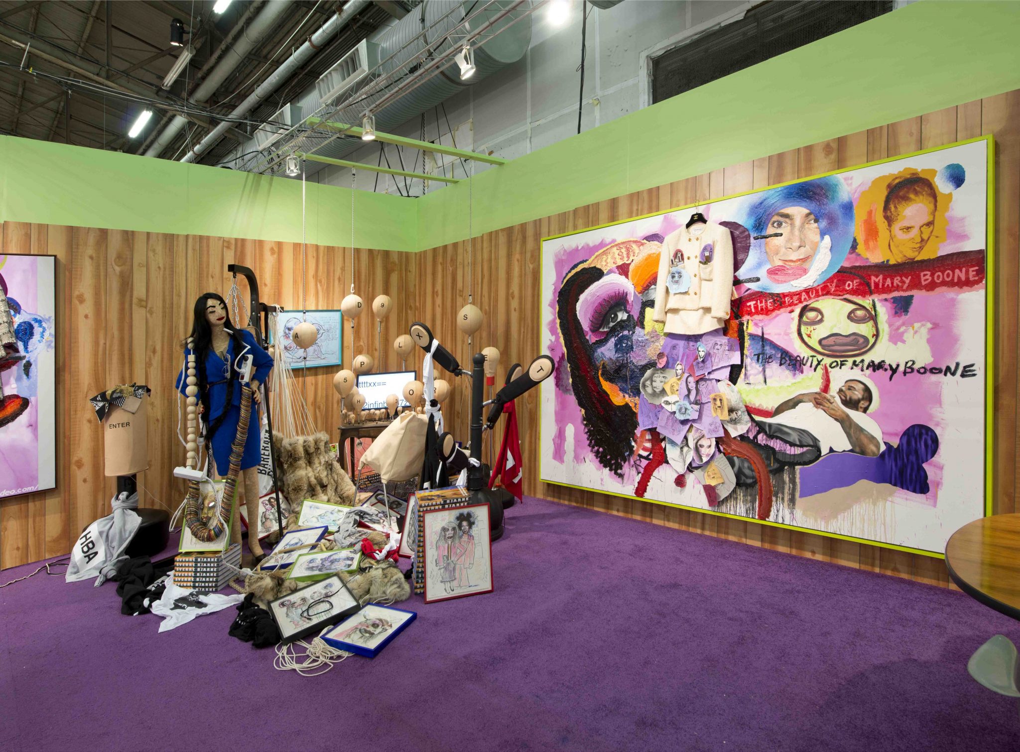
DEH: Bjarne Melgaard and Sverre Bjertnes’s manic, homo shit show of an installation at Rod Bianco Gallery wins in many ways because it’s so different to anything else. It totally stands out with its bareback gay sex imagery and frantic accumulations of crap. I’ve sung big brooding Melgaard’s praises in the pages of ArtReview before, but I’ll say it again: I think he makes some of the most provocative work about gay culture – well, culture in general –around, particularly how it hews so closely to consumerism and our need for objects and things. He turns these literally to trash. Though this time, he features noted artworld figure Mary Boone. In Chanel. Which is hilarious. Isn’t she dead? Oh wait that’s Pat Hearn, who’s fabulous.
BW: As hilarious as it is to resuscitate Mary Boone — who by the way is not dead — in the form of rag dolls, paper collages and combines made from Chanel suits, Rod Bianco’s booth looked like an overflowing mess — it was even more busy than the eyesore by Assume Vivid Astro Focus at Suzanne Geiss a few aisles away. The first time David walked past it, he said “Ew, gross,” before realising it contained works by Melgaard, who is, of course, his favorite dick-loving artist. Still, I did appreciate the homage to one of the artworld’s most notorious — and grudgingly beloved — dealers, especially in an age when dealers no longer seem to have distinct personalities. If the Armory was any indication, they fall strictly into two categories — pert men wearing tight-fitting gray suits, and pretty blonde women in oversized eyeglasses. Even though I didn’t live through the Boone days, Melgaard and Bjertnes’s installation made me nostalgic for a time when dealers were attractions all by themselves.
Honor Fraser
BW: One of the things I liked the most about the Honor Fraser booth was how well it was hung. Unlike most of the other galleries, which crammed disparate objects on their wall spaces like they were miniature curiosity shops, Fraser used a discerning eye.
Leila Heller
BW: I stopped in my tracks on my way past Leila Heller Gallery’s booth. Out of the corner of my eye, I thought I saw two men lounging in the booth — it turned out to be a sculptural work by London-based Iranian artist Reza Aramesh. Wrought in the same hyperrealist manner as works by Ron Mueck, the piece depicted a young man, his shirt torn open, lying in the lap of a second man kneeling behind him. Both were about half the size of an ordinary human. Their features marked them as Arab. It was clear that outside of the space and time of the work, something violent had occurred — the kneeling man draws his hands away from the skin of the other, as if they are sticky with blood. But there are no visual signs of a struggle — instead, the forms take on the same pallid qualities as the bodies in Gericault’s Raft of the Medusa. Aramesh, who also had photographs in the booth, draws inspiration from violent war images culled from places like Palestine and Syria. He managed to sober me up from my mood of gleeful dismissiveness — somewhere outside the Armory, wars are being fought. Art, even in the commercial realm of a fair, can remind us not to forget that. David also paid attention, but his first reaction was, “Who are those two fags cuddling in the booth?”
DEH: Indeed. It’s figuration was so realistic it really stood out in the crowd, though it was kind of the ugliest thing I’ve ever seen, though the jury is out for me on whether that makes it so bad it’s good or if it’s just bad, period. Regardless, it was a nice counterpart to the gallery’s heteronormative section, which featured a glistening white wedding cake sitting on a table. A slice of it was taken out, and in it’s place, a little mouse was projected. On either side of the table were chairs with little screens as heads, displaying a man and a woman respectively. Breeders, ew. This too, though, was also so bad, as if it had been made by an undergraduate with a high-production budget.
Galerie Eigen + Art
DEH: Everyone thinks I’m a fan of this gallery’s painting-heavy booth because I’m such a homo: the work is so masculine, so of course I’m a fly to light. The canvases are mostly darkly-hued, with bearded dudes depicted in more than a few of them. With its German Expressionist-like male figures on the top and soft-edged, organic abstraction on the bottom, Ryan Mosley’s Three Peak Raisers (2012) is perhaps my favorite, as is the very wide abstract expressionist canvas of overlapping colour dabs, which almost make it glisten. But maybe the real attraction is the way the works all cohere and complement each other, which is rare at this fair.
BW: My first impression of the paintings in Galerie Eigen + Art’s booth were that they looked like the sorts of thing your great-uncle, an amateur artist harboring secret aspirations towards greatness, had been storing in his attic for years. They had the sort of loose, experimental brushstrokes of someone striving towards figurative abstraction, but failing to understand how a form coheres. Three Peak Raisers looked like a study for the back of a deck of cards — or the cover art to a Grizzly Bear album.