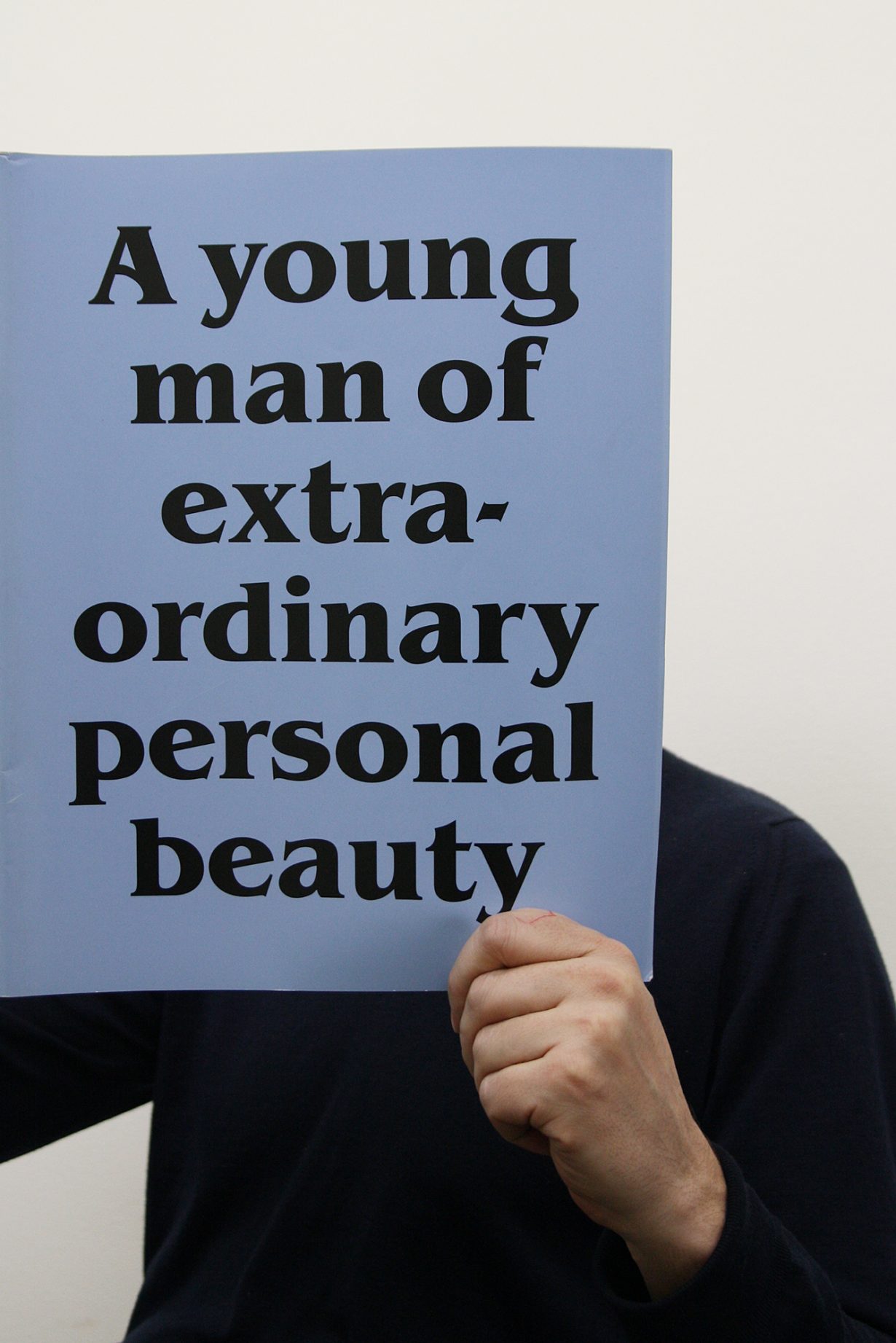
Morgan, who designed ArtReview in its present incarnation, will be remembered as an inspiration, collaborator and friend of the magazine

ArtReview, in its present incarnation, was designed by John Morgan in 2013. He described it, at the time, as ‘a calm, simple structure that allows for moments of playfulness’; typically for John, this understated the complex process of thought and experimentation that had led him to reconnect a chameleonic publication to its 1940s socialist roots (aka its identity), while simultaneously creating a space in which all that (its identity) might sometimes recede into the background to allow contemporary art and the documentation of it to take centre stage. Of course, his description was also precisely what ArtReview likes to imagine it is and precisely how John actually was. John created designs that seduce without being showy; that conceal a fastidious attention to detail behind a surface of ease. When he died, on 2 September 2025, ArtReview lost an inspiration, a collaborator and most of all a friend.
John was one of the most celebrated and influential typographers and graphic designers of his generation. ArtReview had looked in envy at the David Chipperfield Architects brand book (2008), as well as at the elegance of John’s work with 6a architects and Raven Row, and the typography he had developed for AA Files and the Familiars series he’d undertaken with Four Corners Books (working with artists including Donald Urquhart and David Musgrave on new responses to classic novels and short stories). For John, clarity and a generosity to the reader did not necessarily mean stark minimalism: ‘Let the content speak for itself and don’t try too hard’ was his maxim. So, while he left plenty of space for ArtReview’s writers to breathe (he added an extra 5mm to the width of a magazine, describing the move in tonsorial terminology – which spoke again of his capacity to communicate complex ideas in a very direct, powerful, playful way – as the difference between a skinhead and a suedehead), with the Lexicon typeface (designed by Bram de Does) clipped and clear, and images more often framed with white borders, John revelled in interruptions and messing things up before they got clinical. On turning to food photography for a cake that graced the cover of ArtReview’s 70th anniversary issue in 2019, John wrote a typically succinct email: ‘Phone about to die. What if the middle sponge is naked (just the jam dripping from a jam layer on top of it). Might look less perfect which could be better’; another unearthed missive concerns possible graphic inspiration for a Power 100 issue, indicative of the humour involved in much of his decision-making: ‘I love this from the Compendium of Demonology’.
In this vein John invariably avoided describing his aesthetic style too precisely (at odds with the precision he brought to the job), preferring to foreground intuition. It’s one of the reasons he kept his studio small, rarely employing more than a handful of people. ‘Atmosphere is a problematic and woolly word, but it’s the best description of what I aim for in my work. It’s the sensation you find when you walk into a building or space and it changes the way you feel.’
John was born in 1973 in a small Lancashire village, retaining his accent as he studied Typography & Graphic Communication at Reading University. His father, a biochemist whose real passion was stationery, was an inspiration. The teenage John romped through John Berger’s Ways of Seeing (1972) from his parents’ bookcase and at college he’d get a letter from home once a week in a different typeface, the font fully credited.
On graduating in 1995 John took a job in London at graphic designer Derek Birdsall’s Omnific studio. On establishing his own practice in 2000, John Morgan studio, he adopted Birdsall’s passion for long client lunches and grappa aperitifs. It proved a winning strategy, attracting early commissions from the Church of England, for a new edition of Common Worship, the Anglican prayer book (passed to John by Birdsall), and the Design Museum, London.
Maintaining just a few clients at a time, John could turn his attention from pamphlets to pavements: in 2012 the studio created the graphic identity for the Venice Architecture Biennale; and the following year the studio started on a long-term collaboration on the signage system at Tate Britain (a system that must impede as little as possible on the art, John thought). That the creation of brand and style guides (other clients included the Royal Drawing School) formed a recurring motif in John’s work was typical of his forward thinking, generosity and open mindedness – he was aware both of the usefulness of leaving trails of breadcrumbs and the reality that others might work with or rework his designs in years to come. In 2016 John was appointed Professor für Entwurf, Typographie und Buchkunst at Kunstakademie Düsseldorf, and in 2017 he set up the type foundry Abyme with Adrien Vasquez. The studio continued working on the day-to-day design of ArtReview until 2022, John’s ‘atmosphere’ maintained by the magazine’s designers, while the art director’s ad hoc emails were as attentive to detail as ever: ‘Just needs a tighter crop perhaps. Just sprained my ankle. I’m on codeine and booze, over and out.’
From the October 2025 issue of ArtReview – get your copy.