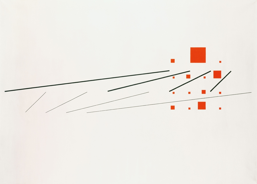
The list of artists, from Anni and Josef Albers to Heimo Zobernig, whose works are included in Adventures of the Black Square, is enough to tell you that the exhibition promises great things. The densely packed downstairs gallery is a monument to the history of geometric abstraction. Form and colour cascade down on the eyes, ebbing and flowing deliriously. Each work is as radical as the next. The ‘black square’ that opens the show is actually Kazimir Malevich’s Black Quadrilateral (undated), borrowed from the Greek State Museum of Contemporary Art, and painted around the same time as Malevich’s Black Square (1915), making this a centennial survey of geometric abstraction. Black Quadrilateral’s relatively diminutive proportions (17 X 24 cm as opposed to the more famous version’s 79.5 X 79.5 cm) do not detract from its status as a kind of ‘year zero’ totem for Modernism. Briony Fer has written that Malevich’s square ‘stood as a utopian gesture pointing the way to the future’, while Donald Judd again emphasised the idealistic nature of the work, describing it as ‘like a single malt whiskey: pure and simple’.

Adventures of the Black Square, Whitechapel Gallery, installation view. Photo: Stephen White
Max Bill’s Simultaneous Construction of Two Progressive Systems (1945–51), encountered moments after Black Quadrilateral, is equally extraordinary. Black lines in oil paint, differing in thickness, slash across a painted cream canvas. A series of red squares punctuate the composition to the right of the painting. It’s poetic, powerful – an arrangement that, oddly simultaneously, is both violent and sensual. The curators, Iwona Blazwick and Magnus af Petersens, respectively director and curator-at-large of the Whitechapel Gallery, use the work to demonstrate abstraction’s travels southwest, across the Atlantic, to Brazil. Hung alongside, in art-historical order, is Judith Lauand’s wood, acrylic and metal wall-sculpture Madeira Gravada e Pintada (1956) and Waldemar Cordeiro’s Untitled (1958), a deep red oil-on-canvas plotting a landscape via an arrangement of orange and red triangles and blue squares across the centre. These examples of Concretism are followed by one of their successors, Hélio Oiticica’s neoconcretist gouache on board Metaesquema 464 (1958).
This enjoyable but not particularly illuminating ‘adventure’ along the well-trod routes of geometric abstraction’s global spread continues apace via the usual suspects: the Bauhaus, modernist architecture and a link into Minimalism via Carl Andre’s 1967 floor piece 10 X 10 Altstadt Lead Square are dutifully covered. The works, as independent entities at least, are roundly excellent, but the curating is breathless. One of the most innovative parts of Blazwick and af Petersens’s narrative, for example – containing examples of geometric abstraction from Asia, the Middle East, Near East and Eastern Europe – gets squeezed into a small corner. Herded together (ghettoed?), these include Rasheed Araeen’s Chaaryaar (1968/2014), a sizeable sculpture of different-coloured cube-shaped wood frames; Hassan Sharif’s series of documentary photographs with the self-explanatory title Drawing Squares on the Floor Using a Cube (1982); Saloua Raouda Choucair’s small carved-wood sculpture Poem (1963–5); and Dóra Maurer’s Seven Rotations 1–6 (1979), an infinity-mirror-like set of photographic self-portraits, in which Maurer starts by holding a blank square, which in the second in the series is replaced by the previous photograph, and so on. These works happily take the narrative away from the much-mapped idea of geometric abstraction being essentially mechanical or mathematical, to look instead at a possible relationship to ritual and performance and the political context of its production. More new insights such as this would have been welcome.

Saloua Raouda Choucair, Poem, 1963–65, wood. Photo © Tate, London 2014
Amassed like junk in an art fair, the heavy hang does these contemporary works no favour. It is hard to discern the curators’ point with this part of the exhibition
While the dense hang downstairs is successful – the individual historical works hold their own against neighbours, the clutter lending the show itself a certain abstract quality in which form and colour between compositions seem to overlap – this device of overfilling the space falls apart upstairs. Amassed like junk in an art fair, the heavy hang does these contemporary works no favour. It is hard to discern the curators’ point with this part of the exhibition. Either they are throwing a (mightily odd) curveball at their audience, presenting a show of works that demonstrate where the original impulse of the black square died; or this is just a genuinely facile grouping. The inclusion of Andrea Fraser’s May I Help You? (1991) in the corridor before one enters the upper main gallery space hints at the slightly extraordinary thought that the curators themselves might not be behind the work they are showing up here. In this video, a monstrous artworlder walks around an exhibition of black monochromes by Alan McCollum, the performer suggesting, in a script sewn together from auction catalogue texts, museum guides and press interviews with dealers, artists and collectors, that contemporary geometric abstraction merely fulfils the role of taste signifier and investment opportunity. The inclusion of two photographs of office lobbies by Hannah Starkey, seen just as one enters the main space, continues this point. Half the work here would look perfectly at home in the bland spaces of the capitalist sublime.
Falling into the realm of logos and corporate design, for example, Sarah Morris’s dully inoffensive Olympic ring painting 2028.07 (Rings) (2008) and Peter Halley’s glib neo-geo Auto Zone (1992) fail to rise above the models they are critiquing. Other works merely use geometric abstraction as a means to a conceptual end (Willem de Rooij’s wax-print-on-cotton floor work, Blue to Black, 2012, for instance), and it’s hard to determine their exact relevance to the story of this type of abstraction. If this idea of a curatorial self-critique is a conspiracy too far, then the alternative, given the predominance of pastiche and works in which the aesthetic is coincidental, concocts a sorry end to this once glorious art-historical line and an abysmal close to this wayward institutional adventure.
This article was first published in the April 2015 issue.
