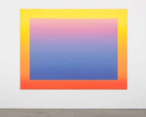
The Suicide Paintings are neither abstract nor figurative. The main body of work in the show comprises 11 canvases, all alike in that they feature smooth linear colour gradients in airbrushed acrylic. Each canvas has a generous border that is also a colour gradient, which often works to balance or enliven the colour in the centre. Depending on how you look at the paintings, they appear as kitsch imaginary vistas or formal colour studies exploring different theories from a painter’s rulebook.
At one moment a canvas will seem to be the former, bringing to mind the fading pastel blue-pink sky of a blown-up Botticelli, or the impenetrable pixelated palette on the iPad’s Brushes app that manages, with surprising ease, to merge garish colour combinations never seen on canvas (indigo into pale peach via olive-green). The next moment you are looking at a simple grey tonal study. The most visually impressive canvases demonstrate the effectiveness of the simplest of painting theories: that a colour’s intensity varies depending on what frames it or surrounds it; light is only light when offset by dark, and vice versa. But always the colour is lively – has the effect of moving or vibrating – and is almost aggressively present.
This is the artist who gave us endangered pandas in glitter, designed a pair of Jimmy Choos and installed a chrome-covered Andy Monument (2012) outside Warhol’s Factory in New York. So what to make of these paintings, which appear to riff on the ‘death of painting’ debate – where do we find Pruitt’s signature wit and droll take on pop culture? The first clue is his 2012 Faces series of colour gradient paintings, featuring hand-drawn faces expressing reductive emotions (angry, puzzled, etc): the result being that a story or dialogue takes place between the background colour and the mood expressed. In The Suicide Paintings, the colour combinations are more complex and there are no emoticons to tell us how we should feel. The absence of a story is made alarming by the scale and intensity of the encounter with colour on canvas. In a small anteroom, chromed television sets have been mounted on white-and-black boxes that allude, seemingly, to blank pixels. How far are our moods, our emotions, projected or simplified by our worlds, by pop culture in particular, Pruitt asks, and what happens to our identities when you take that away?
Contemplating the exhibition title, and connected metaphors for life and death, one begins to see the paintings in a different light. These hypnotic vistas, reminiscent of flatscreen TVs in both proportion and aggressively slick vacuity, are perhaps not visions of our possible suicides, but visions of our actual digitally mediated suicides. The delivery of the concept feels messy (sculpture, word, paint, even previous Pruitt paintings), and perhaps that’s the point: in a world where the pixel is king, pop culture has lost its punch. It is all very wry and very clever. Very Rob Pruitt.
This article was first published in the December 2013 issue.