As surveillance culture and the mass gathering of data have grown, so too has the culture of data communication. All the information swept up in the efficient, automated gluttony of the information-technology data grab needs to justify its rude acquisition – with every movement, transaction or conversation becoming potential fodder in the scramble to find meaning in the pattern of human behaviour, the less sensitive fruits of ‘big data’ are released to the public, making humanity en masse not simply the subjects of the data gathering but, increasingly, the enthusiastic consumers of it too. Given that little of the world’s population is equipped with advanced skills in statistical analysis, or even nimble numeracy, increasingly the way we consume the data made available to us is in the form of diagrams.
In the broad sense, the field of data visualisation dates back as far as the earliest analytic or technical diagram, but in the specific contemporary sense – the translation of data sets into the visual language of graphs, maps, charts and diagrams – it emerged properly during the nineteenth century. Thanks to a combination of factors – which include not only data proliferation but also the espousal of the medium by international broadsheets including The Washington Post and Le Monde Diplomatique, and dynamic educators in the field – we are now in its flowering.
Within the space of a decade, data visualisation has become a bona fide popular artform, embraced and trusted with a delight seldom afforded the kind of ‘raw’ statistics and data that lie beneath
Data visualisation has already yielded bestselling books such as David McCandless’s Information Is Beautiful (2010), and iconic works such as social scientist Eduardo Salcedo-Albarán’s Mexican Drug Cartel ‘La Familia Michoacana’ (2010), which maps the complex web of connections surrounding an organised crime group in an elegant rosette. Within the space of a decade, data visualisation has become a bona fide popular artform, embraced and trusted with a delight seldom afforded the kind of ‘raw’ statistics and data that lie beneath.
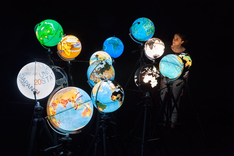
“One reason we trust images more than data is because we’re wired to respond to them – data and information need a different language to reach people,” explains José-Luis de Vicente, co-curator (with Olga Subirós) of Big Bang Data (2014) at CCCB, Barcelona. The first in a series of exhibitions looking at crisis, technology, economic models and emerging phenomena, Big Bang Data examined data’s status as the cultural expression of the computer age. Sections within the show looked at the physical weight of data, emerging fields of analysis and the structure of data-gathering systems, as well as the limitations of the worldview provided through the prism of big data. The dynamic, immersive nature of the exhibition was testament to the inventive heights that data visualisation has now reached. The inclusion of works such as artist Chris Jordan’s seven-metre-wide, six-panel ‘photograph’ of 2.3 million prison uniforms evidenced, too, a cross-disciplinary fascination with the field.
“It’s not a space of scientific enquiry; it’s a cultural area”
A linked ‘Data Cuisine Workshop’ during Barcelona’s June–July Sónar Festival generated visualisations through food, illustrating emigration patterns from Spain via nation-specific fish recipes, or preferred routes to orgasm through varisized splats of coloured sugar. The ragged, handmade results of these ludic exercises underscore the gulf between the quasi-scientific prestige that data visualisations enjoy, and their actual status as created works. “It’s a completely subjective way of representation,” explains de Vicente. “It’s not a space of scientific enquiry; it’s a cultural area.”
Unlike ‘raw’ data, which can make issues seem overwhelmingly complex, confusing and even chaotic, most data visualisations are graphically calming, even as they illustrate unpalatable facts; they appear to reverse the terrifying creep of entropy, bringing harmony to disorder. The power of a good visualisation lies in its seductive comprehensibility and graphic punch, though there are pitfalls to both. Oversimplification can make a mockery of the data it is trying to communicate, while visual loveliness can distract from the message. Yale professor Edward Tufte, whose Beautiful Evidence (2006) is one of the key texts in the field, warns against the phenomenon of ‘content indifference’: ‘For serious work in reasoning about evidence, the essential test of text/image relations is how well they assist understanding of the content, not how perfectly stylish the pages look.’
The voguish status of data visualisation within popular culture leads to design tendencies that detract from its function as a tool of communication. Designer Stephanie Hankey cofounded Tactical Tech just over a decade ago to negotiate a gulf she had identified between NGOs and graphics studios. Working on advocacy campaigns such as the right to water, or protecting sex workers against violent attack, Hankey’s workshops for NGOs help them understand the impact that visualisations can have in their work. For organisations whose be-all and end-all is the gathering of information, the urge is always to cram in as much as possible: “It’s hard to resist the temptation to put everything in – we try to give [NGOs] the confidence to just pique someone’s interest.” On the flipside, Hankey finds it necessary to steer cutting-edge graphic studios around cultural sensitivities and to avoid clichés in the representation of African women, or even death, in an infographic.
The power of a good visualisation lies in its seductive comprehensibility and graphic punch, though there are pitfalls to both
‘Cool’ graphics that might be a hit on Tumblr pages or data-visualisation Pinterest boards, where they will be of interest for the novelty of their design, seldom translate as effective tools of mass communication. In Tactical Tech’s recently published Visualising Information for Advocacy (2013), the most powerful visualisations are those in which the aesthetic aspects of the design take a backseat – eg, Wikileaks’ baldly comprehensible Spy Files (2012) project, which allowed readers around the world to find out which companies were making and selling surveillance tools, Visualising Palestine’s Across the Wall (2012), which uses an apparently simple bus map to show relative freedoms of movement on either side of the ‘green line’ between Israel and the West Bank, and Kamel Makhloufi’s translation of deaths in Iraq between 2004 and 2009 from a chronological hodgepodge into a clean set of blocks showing the proportion of those killed in military engagements divided between ‘friendly’ troops, host-nation troops, Iraqi civilians and ‘enemies’.
For Tufte, the visual display of information ‘is a moral act as well as an intellectual activity’. Beautiful Evidence describes uncluttered, multilevel flights through data from a ninth-century zodiac diagram to PowerPoint crimes (‘the metaphor is the map, not stupidity’) and an epidemiological diagram tracking the spread of SARS. While Tufte reiterates the duty to pure representation and the honest translation of data into the visual field, other practitioners argue that not only is the notion of objective representation of information impossibly utopian but that it also skims over any bias, deliberate or otherwise, in the ‘raw’ data itself.
In his essay ‘Disinformation Visualization: How to Lie with Datavis’ (2014), designer and theorist Mushon Zer-Aviv picks apart the ‘evidence’ presented in contradictory interpretations offered from a single set of statistics by organisations on either side of the pro-choice / pro-life debate in the US, and analyses the emotive tools in the resulting data visualisations. His workshops on the same theme have encouraged students to ‘lie with datavis’ to produce diagrams that are either selective in their interpretation of data (such as a map showing the link between high alcohol consumption and creativity) or manipulative in their use of visuals (the near stranglehold on the Finnish grocery market by two large supermarket chains represented as a benign force, under threat from a hostile incomer).
Zer-Aviv admits that an image can potentially be ‘evidence’: “But to think that it is pure truth and unchallengeable – it’s not really the case. More and more people are creating data-driven images – we need to learn how to read them and to develop discourse. We shouldn’t be afraid of them, but we shouldn’t see them as text or actual data.” Instead of ‘beautiful evidence’, Zer-Aviv argues for data visualisations to be considered ‘beautiful arguments’ – images that we assume to have an agenda. “The more ethical perspective on data visualisation is one that doesn’t hide the questions and ambiguities.”
Instead of ‘beautiful evidence’, Zer-Aviv argues for data visualisations to be considered ‘beautiful arguments’ – images that we assume to have an agenda
Concurrently with the popular rise of data visualisation, big data, its methods of retrieval and the attempt to find meaning through the creation of systems in archives, libraries and object affinities have all emerged as important concerns in the work of artists including Hito Steyerl, Trevor Paglen and Camille Henrot. While they may share common aspects of visual language, it is this rejection of ambiguities within data visualisation – echoed in a tendency towards an aesthetically resolved quality that buttresses against the chaos of the world – that marks the important point of separation between the two fields.
This article was first published in the December 2014 issue.