What responsibility does museum architecture have to its immediate locality?
A museum is a necessarily public building. A Tate or a Pompidou may have a global profile thanks to what it contains (and its ability to advertise that), but what responsibility does its architecture have to what it does not contain: its immediate locality? One place to start is at the building’s most liminal point: the front door, which needs, for all the reasons you can imagine, to be obvious.
The Metropolitan Museum of Art in New York is one of those grand edifices that thinks of itself as an essential part of some grand canon of Western architecture: lots of dormers, columns, stone, and quite a bit of straight pomposity. Galleries, libraries, faculties, parliaments, from Manchester to Memphis to Mumbai, wear these clothes – architectural vestments of a Graeco-Roman variety. A vast staircase lifts you into a Grand Central Station of (mostly old) objets, full of people, airy halls leading off to the ancients, to Abstract Expressionism, to fashion, to shops, to toilets, all from one monumental internal piazza. But don’t let the late-nineteenth- century Beaux-Arts wrapping fool you; even the technicolour razzmatazz of the Pompidou follows this prescription. It is a rectilinear block with a front door right down its middle that opens out to the centre line of a Parisian square, guiding visitors into a large lobby not dissimilar in formality and spirit to the Met’s. Even museums that inhabit buildings for which they were not purpose-built follow this user-friendly DNA. The Museo Reina Sofía is in the refurbished Madrid General Hospital with broadly the same spatial conditions as the Pompidou.
The discontents of late-twentieth-century architecture, however, led to some wild deviations in situating the urban museum. Arata Isozaki’s Museum of Contemporary Art Los Angeles, one of those rare LA buildings right on the sidewalk, has a sunken entrance hidden from the street as if the street wasn’t even there. Thirty years later, across the street, architects Diller Scofidio + Renfro placed the entrance of The Broad off-kilter on a corner, facing away from its natural cousin, the great Frank Gehry-designed Walt Disney Concert Hall beyond. Aptly named, Grand Avenue is that anywhere-street of loud icons not talking to each other. Thirteen miles west is Richard Meier’s Getty Center, so removed from the fabric of urban life that the fact that it might in any way serve it is almost laughable, a white acropolis that requires a car park and a people-mover to get up to. These are standalone objects in a car-dominated city of standalone objects.

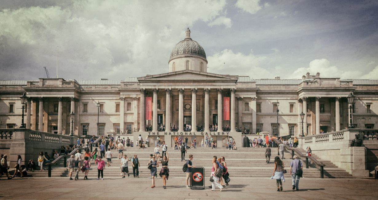
Which brings me to Trafalgar Square and the National Gallery. Selldorf Architects – architects to Hauser & Wirth and David Zwirner – have been employed to refurbish Venturi Scott Brown’s 1991 (now Grade I-listed) Sainsbury Wing as part of the gallery’s bicentennial projects. The National Gallery has been in its Trafalgar Square setting since the 1830s, supplementing William Wilkins’s stone and masonry original through subsequent additions. For much of this history, the gallery maintained a presence alongside the public piazza in front of it, with an entrance along its centreline. It followed the formula.
Commissioned as an extension, the Sainsbury Wing was originally a supporting character to the wider whole of a global museum, tucked slightly offside Trafalgar Square. Yet in the time since, the wing has taken on the role of the main entrance. There are millions more visitors now – and long queues of slightly befuddled tourists looking for the front door. It’s not obvious.

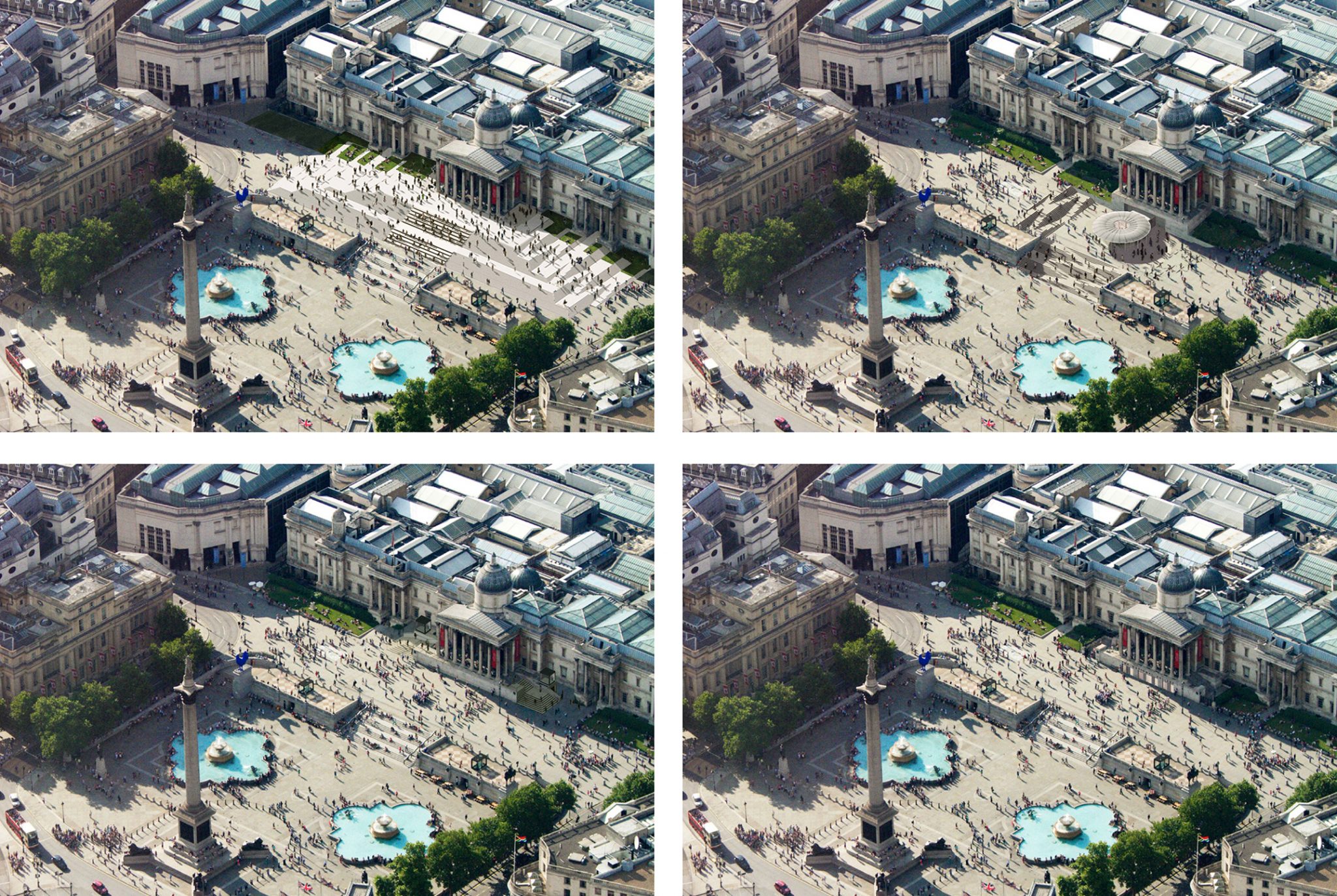
There is a missed opportunity here for museum to better speak to city. Why not restore the gallery’s principal entrance to the portico on the Wilkins building along the centreline of the great square? It currently presents on Trafalgar Square as a long sort of impenetrable wall, as if it were a background. As a hinge between Trafalgar and Leicester squares, two of London’s most important public spaces, a central entrance could unlock a new route with wider positive benefits to the city.
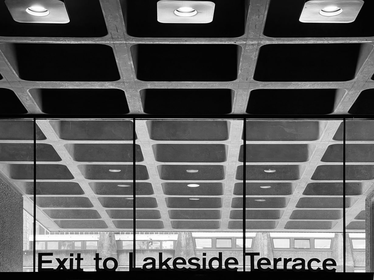
With that nagging preoccupation to expand audience and public engagement, might the architecture of a public gallery first be an exercise in urban design? A museum or public gallery’s architecture should nurture a bond with its city by urbanising its edges in both macro and micro ways, in apparent and visible ways; a type of porosity found in multipurpose arts complexes such as the Southbank and Barbican centres. Seemingly simple things – like a door, or small surgical interventions in the ‘right’ place – can yield significant wide reaching benefits for agendas both urban and curatorial. Rather than coy glances away, on the one hand, or haughty distance from the hustle of urban life on the other, let there be more front doors, better welcomes, easier ways in, through and via. The first thing the architecture of today’s arts spaces should do is to not be afraid of the obvious. Look out, not in.
Daniel Elsea is a director at Allies and Morrison, the London-based architecture and urbanism practice
