Power dressing, they used to call it in the 1980s: all shoulder pads and tailoring, broad shoulders and tight waists. This was an image rooted in an 80s idea of power: individualist, corporate, synthetic and processed, power was working out to gated drum sounds played through orange foam headphones attached to portable electronics strapped to tight Lycra.
Power dressing is a form of cultural expression – a way of articulating an era’s own idea of what power is, where it comes from and what it looks like.
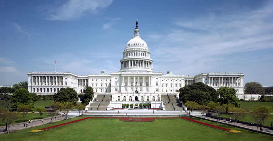
It happens outside the world of retro music videos and soap operas too. Think of the real seats of power. The US Capitol with its gleaming white Neoclassicism. All its columns and capitals, its porticos and plinths, are like a movie set of Ancient Greece at the heart of the New World: there to invoke the image and idealism of its democracy, its enduring significance and all the rest. It’s a way of bestowing legitimacy on a young democracy, a way to make its own form of power seem plausible and a way of dramatising power.
Or think of the Palace of Westminster, a very different image of power: its Gothic Revival treatment suggests Machiavellian intrigue in all of its neomedieval corridors and alcoves. In it too is an idealised image of Britain’s own history, its island independence, its split with Rome, even its origin myths. That’s what tourists take pictures of when they snap a selfie with Big Ben in the background, even if they don’t know it.
As we approach our own era, the image of power mutates. And as it does, something strange seems to happen.
At the inner sanctum of British government we find 10 Downing Street’s Cabinet Room, designed by William Kent in the eighteenth century: Corinthian columns, brass chandeliers, big oak-topped table, solid mahogany chairs and marble fireplace. Yet in the 1990s a style of governing emerged that was at odds with this formality. During Tony Blair’s premiership an alternative – dubbed the ‘sofa cabinet’ – developed. No, not a new furniture hybrid, but a relaxed, informal kind of power centred upon an icon of the domestic landscape. Soft (furnishing) power, as a place to cook up military intervention in the Middle East.
The aesthetic of power has shifted. It is more often located in places that look like normality, hidden in plain sight
The aesthetic of power has shifted. It is more often located in places that look like normality, hidden in plain sight. Why would it do this? What would be its motivation? We could argue that this strategy is a response to our increasing dissatisfaction with and distrust of power and the powerful. Dressed in jeans, perhaps its invisibility only serves to preserve its core. After all, it’s not power itself that changes, but the way it chooses to show itself.
Perhaps this phenomenon is even more explicit in the artworld – in the spaces that it constructs to conduct its rituals and business. The gallery as an architectural edifice was once drawn from the same image hoard as parliaments and banks: neoclassical buildings that conjured (or in the case of the Louvre, occupied) the same image of power. But wave after wave of radical practice, of Modernism, Postmodernism and every –ism between and beyond, has transformed this monolithic idea of culture.
You only have to think of Tate Modern’s occupation of an abandoned industrial structure to see how the use of alternative spaces has been institutionalised on a massive and spectacular scale. It’s the absence of all the old trappings of high culture that communicate contemporary art-power.
The idea of the contemporary gallery as an abstract white cube is an inversion, just like Blair’s sofa. It’s the total wiping away of all those associations embodied in historicist detailing that creates a far more contemporary relationship between image and power. The white cube, supposedly neutral, has become the seat of power. Its total absence of rhetoric is its rhetoric. Both government and culture have co-opted design languages and modes that normalise, camouflage and naturalise their inherent power. They bleed into the landscape, their edges and shapes dissolving against the fabric of everyday life. But as they do, we should understand that though they are now disguised as normality, they remain just as powerful. Perhaps even more so.
This article was first published in the November 2014 issue.
