Truth, a difficult enough concept at the best of times, is an especially troubling one when it comes to food. We lurch from crisis to crisis, each of which stems from the sheer complexity of agribusiness, and from the scale and intricate global logistics of farming and food processing. One could argue that it’s in supermarket aisles that we are really confronted with problems of the natural in a contemporary world, where cultural ideas of naturalness intersect violently with economic and technological realties. Furthermore, we might contend that this is precisely where ideas of nature are manufactured.
Even in the world of cheap confectionery – in newsagents’ sweet jars, frozen in tubes of ice pop, bottled in aluminium cans and clustered on supermarket shelves – we see a low- resolution version of the natural world. Nature’s shapes, colours and tastes are approximated as closely as chemistry and food regulations allow.
However blocky and simplified this confectionery world is, there remains a direct relationship between
house of Chanel was a fairly toxic proposition. Cristóbal Balenciaga closed his house in 1968 – it was relaunched in the late 1980s, but not considered a high-fashion label again until almost ten years later, under the direction first of Josephus Thimister then Nicolas Ghesquière.
Yves Saint Laurent himself had wilderness years. It would be ridiculous to reduce his output to a neat set of aesthetic codes – Deneuve, safari, Le Smoking, the Mondrian dress, trouser suits, transparency – he was a mutable, fragile, creative human, as is Hedi Slimane. Accusing Slimane of
the synthetic and the natural, between the sign and the signified. Take colour: red is strawberry, orange is orange, yellow is banana or lemon, green is lime, purple is blackcurrant and so on.
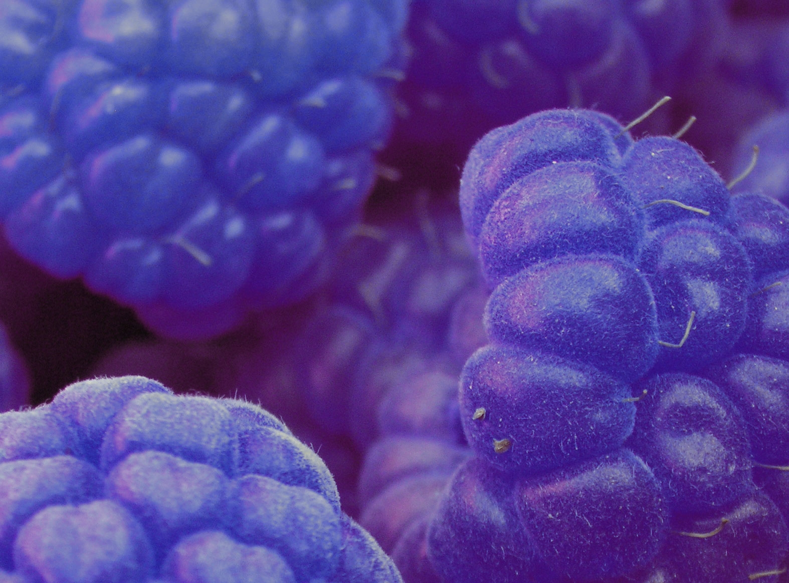
Colour acts like packaging, visually signifying the product’s flavour on the supermarket shelf. It acts too as a synesthetic cue to our taste buds, physiologically nudging us to taste in the right way. Artificial colouring first tells us what something is and then helps us believe in the veracity of an artificial colour’s flavour. But there is an exception to this logic: raspberry. And as we all instinctively know when we reach for an ice pop, raspberries are blue – bright, electric blue.
This wasn’t always the case. Artificial raspberry colour was once made from an extract of coal tar called amaranth (aka E123 or FD&C Red No. 2) that had a dark raspberry-red colour. But in 1976, E123 was classified a possible carcinogen by the US Food and Drug Administration and withdrawn from the market. And into this void, for reasons we will speculate
on later, stepped Brilliant Blue FCF (Blue 1). Or as it appears on your packaging, E133. Or to give it its chemical name, C37H34N2Na2O9S3, chemically synthesised from aromatic hydrocarbons derived from petroleum.
Raspberry’s Brilliant Blue FCF strikes a lightning bolt through the simple call-and-response of synthetic fruit colourings. It’s a bright blue anomaly wherein the fruit and its artificial representation diverge completely. We can speculate that the reasoning runs something like this: there are only so many artificial food colours that are safe to eat, and at the moment FD&C Red No. 2 was banned in the US there were simply no reds free that weren’t already used to signify other red fruit.
Raspberry’s blueness has little to do with the fruit it represents. Instead it’s blue as a thing itself. And like all colours, it has its own histories,
betraying the codes of the house is, in the context of Saint Laurent’s vast and diverse creative output, meaningless. It may be safer for houses to hark back constantly to their iconic output, but National Trust- worthy regard for the preservation of heritage is part of a dogged defence of brand image that can squeeze the spirit out of the very new talents brought in to keep a house alive.
cultures and meanings. Art- historically speaking, blue was a difficult colour to create. It first came from lapis lazuli, the semiprecious stone mined in Afghanistan and exported across the ancient world. The expense and exoticness gave blue a special status that later meant it became the signature colour of the Virgin Mary’s clothes, then of royalty. These are narratives that are not handed to us from nature, but from the practicalities and politics of how we as humans make and use colours.
Raspberry’s blue is an unabashed human blue, not a faux- natural blue. It seems to stand alone against the unnatural world of food production and its desire to naturalise all of its chemical assistance. But raspberry’s blue refusal to imitate nature gives it an unusual truthfulness, an honesty in revealing its origins in the laboratory rather than the field.
This article was first published in the May 2013 issue.