The first thing that comes to mind when walking into Gravel Master, an exhibition of works by Berlin-based artist Dan Rees, is Wassily Kandinsky’s colour theories. Not necessarily because Rees’s paintings ‘set the soul vibrating automatically’, as Kandinsky, in his canonical treatise Concerning the Spiritual in Art (1911), claims an artist can do with colour. But rather the tones Rees uses – mustard-yellow, neon orange, cerulean, hot pink – do not seem arbitrary. Coming upon the canvases, the viewer feels propelled into motion. At the risk of sounding ridiculous, the effect is a bit like dancing.
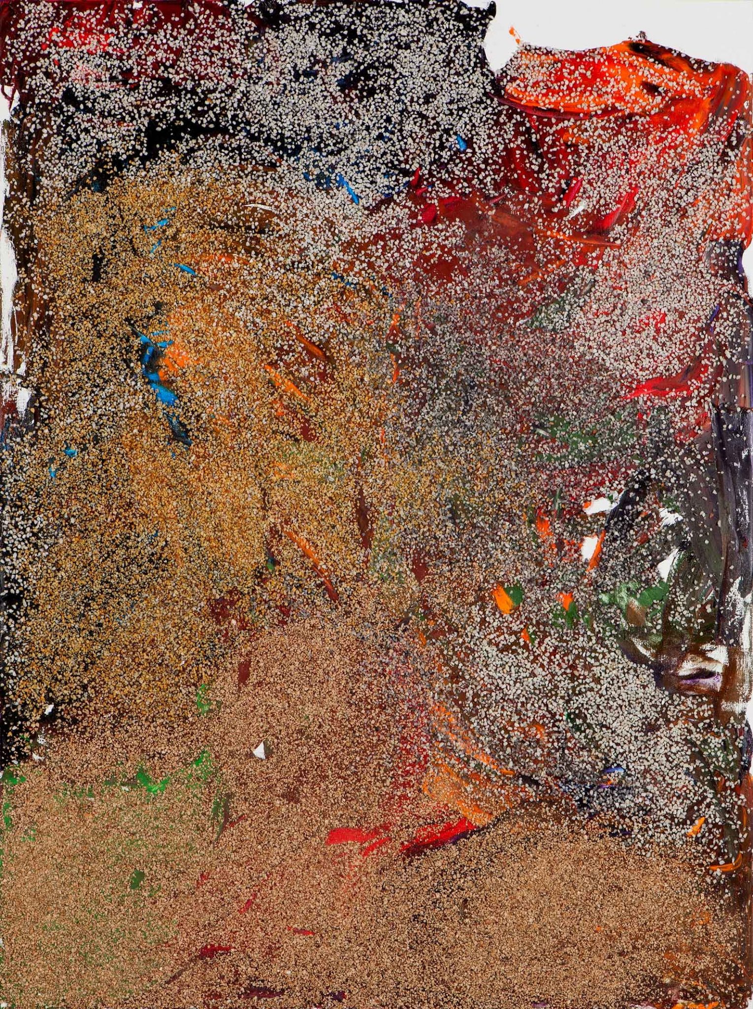
This sense of movement mainly applies to the works hanging in the cavernous main room of the exhibition, where one finds 16 large oil paintings encrusted with pebbledash, a crude sort of cement composed of shells and sand that is used for building in Rees’s native Wales. The artist was inspired to give his canvases such a rough texture after seeing a gravel-coated sculpture by Picasso at the Nasher Sculpture Center while on a residency in Dallas earlier this year. To what end is unclear, but the inclusion of the pebbledash is a characteristic nod by Rees to his birthplace, which frequently appears both materially and conceptually in his work.
Depending upon your art-historical attachments, Rees’s paintings may recall works of Abstract Expressionism, surrealist automatism, colour-field painting, Australian Aboriginal ‘Papunya boards’ or even the ink drawings of the Song Dynasty scholar painters. Nine of the works are arrestingly hung only centimetres apart in a horizontal line on a single wall, like Ellsworth Kelly’s Spectrum V (1969). From far away, each composition looks like a haphazard blob. Up close, the imagination finds figuration. In one canvas dominated by bright reds and yellows, I saw two warriors entangled in battle. In another, a round form accented with turquoise and dandelion yellow looked like a bucolic scene of a bird alighting on a rock. The bright colours in each work help the fantasy along – if they had not been used so masterfully, the relative similarity of the canvases would be boring.
Far less masterful is the Shaker Peg series (2010–11), which hangs in the front gallery. Composed of single works, diptychs and triptychs, the nine pieces, which range in colour from blue to pink to green, are rendered in dull tones, almost as if the paint had been mixed with bits of shit before being applied. Dangled from Shaker pegs – wooden bolts from which you might have hung your coat in primary school – these works are best described as amateur interpretations of Kazimir Malevich’s Suprematist Compositions. To a viewer without any art-historical knowledge, however, they probably just look like unremarkable ‘modern art’ that only deserves a passing glance.