Are the dilapidated commercial sites of Berlin depicted in Sabine Hornig’s photographs simply the occasion for an exploration of object, image and spatial ambiguity? Does it even matter that Berlin is the locale? That the artist is ‘Berlin-based’ is all we learn from the press release before reading that literary reference and metaphysical questions should be our main concerns. Like the protagonist of Transparent Things, Vladimir Nabokov’s 1972 novel that inspired the series and from which Hornig took her title, we are, it seems, faced with an experience of temporal overlap. Art historian Hans Belting thinks so. And his essay on these works is quoted to support this view. But I couldn’t help thinking about the city and of more material things.
A cast concrete rubbish bin stands in the gallery. Nearby is another sculptural element that looks like an aluminium bus shelter and a three- dimensional frame for two polyester-print photographs. There are other objects too. Each one evokes the banal architectural features of Berlin’s streets in ghostly form. Factory-new like minimalist art, their physical presence in the pristine gallery space contrasts with the tattiness of the photographic subjects.
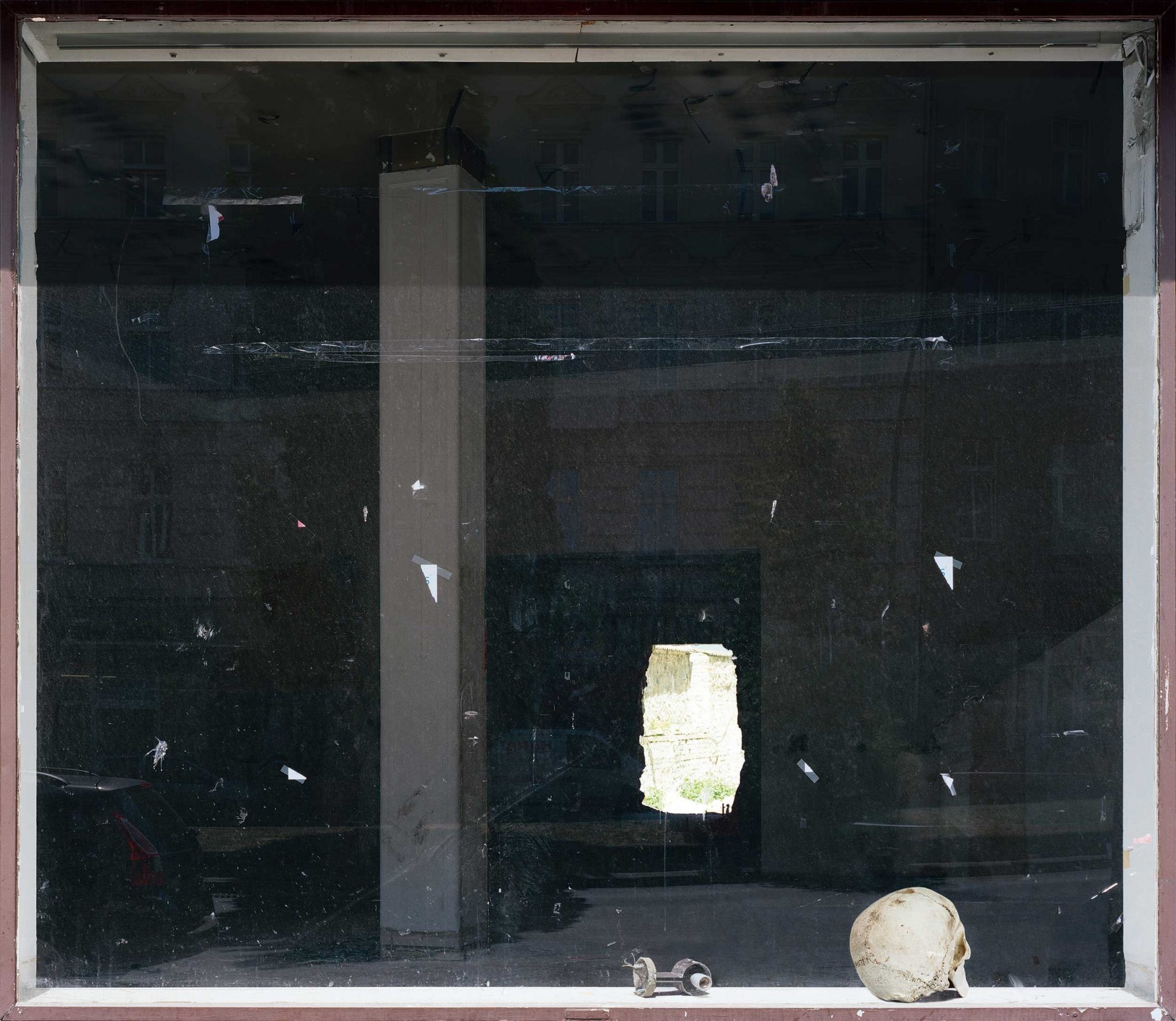
For all but one of these photographs Hornig has pointed her camera at a window. Her technical skill generates spatial ambiguities that never fully resolve. The raw infrastructure of the empty store in Untitled (Backlight) (2009) is seen through a flotsam of paper scraps and cellophane tape – fragments of former notices, posters or flyers – stuck to the glass. Is the murky interior of this disused commercial space an effect of light balance or because of smoked plastic sheeting covering the window? Is this a matter of material surface or temporal exposure? It seems impossible to tell; it’s probably both. Thus the metaphysical questions that the press release speaks of have a more material substructure.
Within the picture, the irregular opening in the room’s far wall, which gives Untitled (Backlight) its title, makes a ragged oblong hole of high contrast. But a foreground ledge that is closest to, and parallel with, the camera lens offsets the dark/light opposition that defines the interior space. This pictorial zone – where a skull and a dismantled lock sit side by side – is light- balanced, unlike the commercial interior, and as such we are once more thrown off balance as we struggle to understand the space.
Similar effects are generated in the other photographs. Still Life by the Window (2010) shows a pile of hilarious kitsch kids’ toys and cuddly animals. In comedic contrast with the seriousness of the memento mori skull in Untitled (Backlight), this one wears plastic sunglasses and has a trompe l’oeil pizza-slice wallet stuffed between its teeth.
From the sublime to the ridiculous, Hornig’s work might indeed provide opportunity for metaphysical reflection, but reflection that is nevertheless grounded in the matter of a living Berlin.
This article was first published in the April 2013 issue.
