Why we’ve moved on from the cultural moment in which minimalism automatically signifies good taste and proximity to wealth
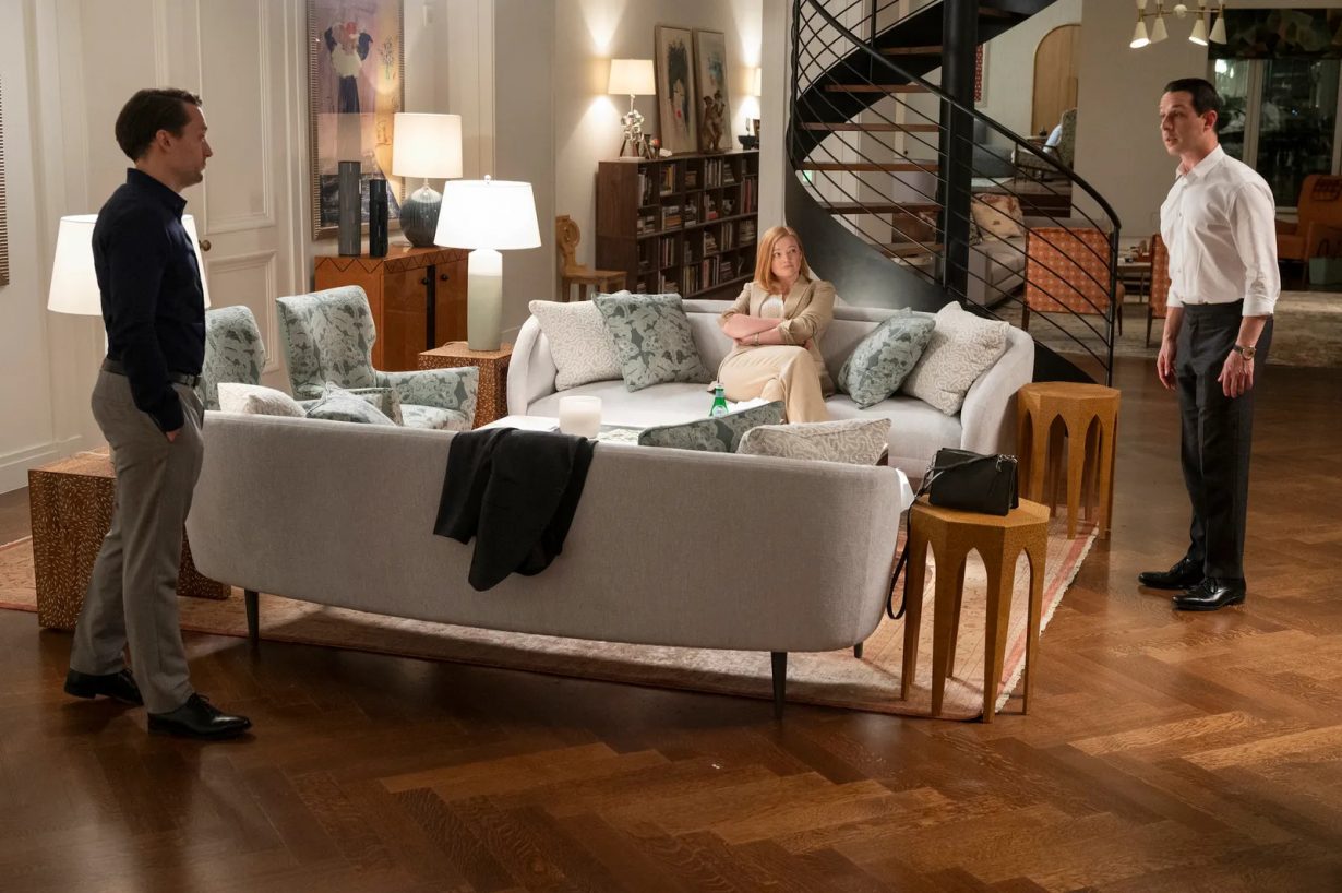
For a concept that’s all about discretion and refinement, ‘quiet luxury’ is making an awful lot of noise right now. Ostensibly the preserve of the very rich and privileged, quiet luxury is an approach to design that favours the use of high-quality materials and exquisite craftsmanship to produce subtle, muted, elegant things – often marked by some discreet detail recognisable only to the initiated few. Prompted in large part by the success of HBO’s Succession (2018-23), in which the dysfunctional billionaire protagonists are positively drowning in beige cashmere jackets and white marble interiors, a strangely deferential admiration for the plain-but-exquisite clothing of the one percent is permeating everything from legacy media to TikTok. With a gleeful lack of irony, guides on how to ‘get the look’ suggest fast-fashion alternatives to Loro Piana and Hermès, as if a £39.99 navy polyester blazer could allow the wearer to be mistaken for the scion of a banking dynasty, or perhaps a distant heir to the throne of Monaco.
It’s nothing new, of course. Since political and economic power gradually shifted, in the seventeenth and eighteenth centuries, from the institutions of court and church into the hands of individuals, ‘stealth wealth’ has been the aesthetic preferred by privileged cliques from Whigs to WASPs. Simplicity of form and excellence of execution have distinguished not only the clothing, but also the architectural and design choices of the ultra-rich who wish to distance themselves from the gilded Trumpian stereotypes of wealth: minimalist interiors, muted colours, rich materials and well-chosen artworks. This aspect of quiet luxury hasn’t received quite so much media attention, primarily because it relates to the private and personal world of the home, rather than the clothed body in public; but also because it’s much more difficult to imitate with limited resources. Not even the richest individuals will change their interiors as frequently as they change their wardrobes; indeed, for a certain subset of the super-rich, there’s significant cachet attached to inheriting one’s furniture, rather than acquiring new items. Witness the contempt of Lady Caroline Collingwood, Succession’s icy matriarch, for her arriviste husband who ‘bought all his own furniture’.

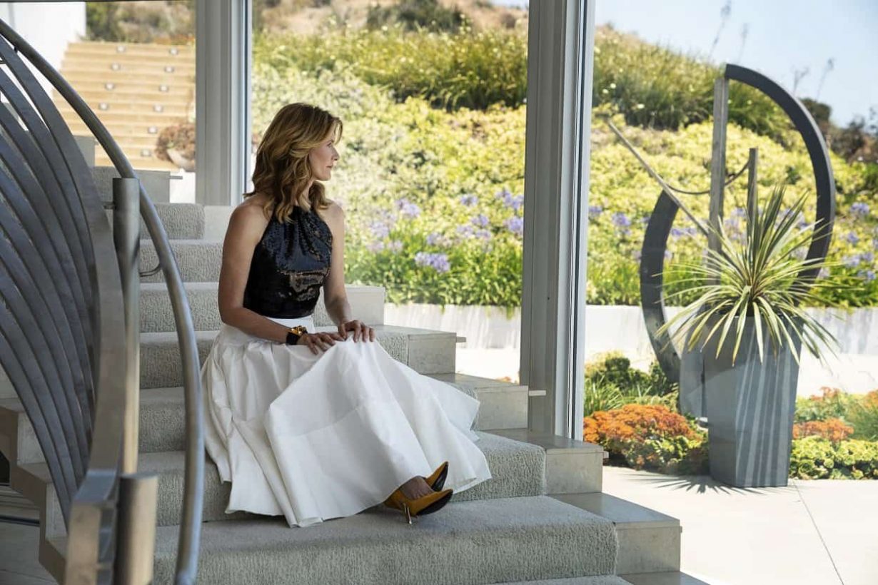
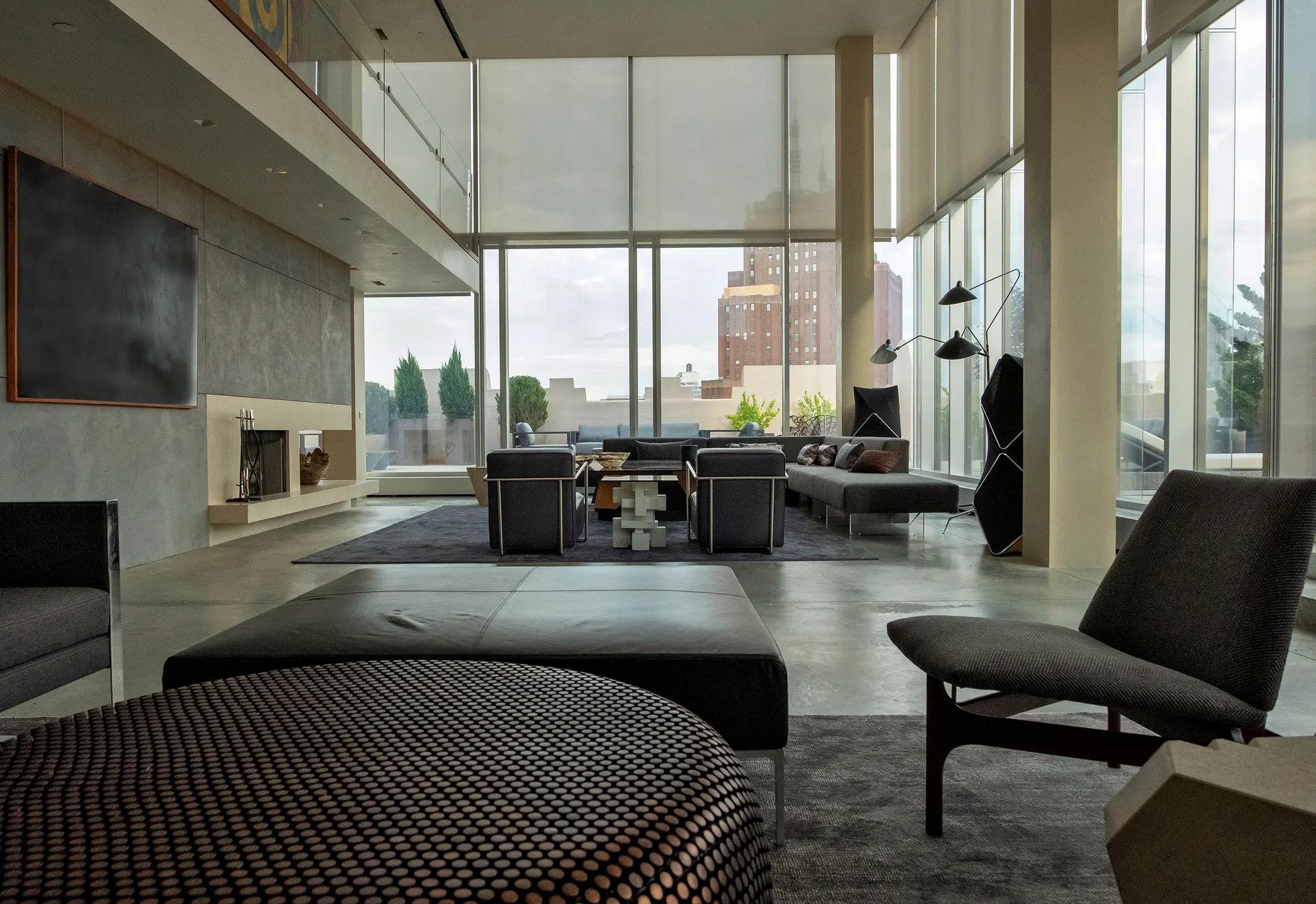
While it might be possible to find furniture on a budget that mimics – however badly – the styles of the wealthy, it’s the contexts in which these items are placed that elevates them to the level of luxury. Large living spaces, generous allowance of natural light, and the invisible labour of domestic staff keeping the detritus of everyday life at bay are the real markers of domestic privilege, which most of us will never enjoy in our cramped flats or suburban semis, except through our TV screens. Consider the Klein family home in Big Little Lies (2017-19): tastefully appointed with Ligne Roset chairs, white walls and chrome accents (and nothing to suggest that a child lives there), these details are nonetheless secondary to the vast, double-height space and enormous curved windows with their view of the Pacific Ocean. The same could be said of the penthouse occupied by corrupt hedge-fund manager Bobby Axelrod in Billions (2016-), a real location boasting 7,500 square feet of space and views across the Manhattan skyline, in which the severe grey and black furnishings, complemented by Artemide lighting, exist only to give some kind of purpose to the space without offering much in the way of intimacy or comfort.

There’s something depressingly cold about these luxurious spaces, not only from an aesthetic perspective, but from a personal one too: the homes of the one percent are put together by professional designers, undoubtedly skilful and astute people but not the actual occupants of the space. Between outsourcing the design process, and living a peripatetic lifestyle across multiple homes, there’s little opportunity for real personal taste or character to sneak in – which might be why so many of these spaces resemble upscale hotels, opulent but transient. A flick through the pages of Architectural Digest, or any other publication showcasing the homes of the wealthy, reveals the invisible hand of the professional at work, producing the effect of intimacy without its substance. When AD published a tour of Gwyneth Paltrow’s minimalist California home in 2022, critics and commentators were swift to spot that Paltrow’s art collection (including works by Ed Ruscha and John Baldessari) incorporated a wire sculpture that was initially identified as a Ruth Asawa piece, but which was later revealed to be a piece by D’Lisa Creager, closely ‘inspired’ by Asawa. Rather than a signifier of Paltrow’s taste, Creager’s work was interpreted as a ‘knock-off’ chosen by a designer to fill a space.
Extremely rich people are not exactly in need of sympathy, but, offscreen and on, it’s hard not to feel that their minimalist design choices are actuated by a kind of anxiety, especially in the case of those who built their fortunes without generational inheritance. The need to fit in, to be acceptable to one’s peers and one’s sense of self, is a need that transcends social class. Yet for the wealthiest, the consequences of a ‘mistake’ are much higher. Looking in from the outside, a life of quiet luxury might have an elitist appeal, but at the cost of authenticity and individuality. Predominantly white people in grey and brown clothes, living in their white homes filled with grey and brown furniture. Where’s the joy?

Perhaps the best, most humanising iterations of onscreen minimalism are those that don’t take themselves too seriously. Nancy Meyers’s films are practically shorthand for a certain kind of rustic minimalism, their set designs mixing neutral tones with warm, textural elements to create a visual framework for her upper-middle class characters. But the pinnacle of TV minimalism must surely be the Seattle apartment occupied by Frasier’s (1993-2004) Frasier Crane, the pompous but ultimately warm-hearted psychiatrist who revels in the details of his neutral, masculine interiors as a reflection of his own good taste and cultural knowledge. A Le Corbusier lamp, Dale Chihuly sculpture and an Eames chair sit in proximity to a beige suede sofa, proudly described by Frasier as ‘an exact replica of the one Coco Chanel had in her Paris atelier’. When Frasier’s father Martin, a retired police detective with blue-collar tastes, moves into the apartment, it disrupts not only his life but also his decor, as Martin brings a shabby, orange and green striped armchair with him (displacing a Wassily chair by Marcel Breuer in the process). At first the chair represents the tension between father and son, but ultimately comes to symbolise their bond as they establish a way of living together in (relative) harmony.
With a reboot of Frasier due to air later in 2023, a contemporary take on the show’s 90s iteration of quiet luxury will offer new insight into what exactly this looks like today. In many respects, we’ve moved on from the cultural moment in which minimalism automatically signifies good taste. The homes of flamboyant reality TV stars like Kim Kardashian are now just as likely to embrace sleek lines and muted palettes, as those of supposedly ‘tasteful’ individuals like Paltrow, to the point that the look has trickled down to mass consumption as the ‘Big Grey Sofa’ phenomenon. With the setting of Frasier shifted from Seattle to Boston, what will the older Frasier Crane’s new home look like? Will prized pieces from his former apartment make an appearance? Or has he abandoned his attempt at quiet luxury in favour of something bolder, to reflect the character’s personality in a more idiosyncratic way? Watch this (well-lit, tasteful) space.
Danielle Thom is a curator at London’s Design Museum
