The uniform, sterile backdrop of art galleries persists – a pristine void for commerce’s ritzy, phantasmic figure – but is there a silver lining in its endurance?
In the spring of 2007, Tate Britain held a two-day conference titled ‘The Rise of the London Art Market’. I shy away from such events, which outlast my attention span, but I was trying to improve myself at the time and so I agreed to go and review this one for another art magazine, whose founding of an art fair four years earlier wasn’t entirely separable from the subject under discussion. The podium lectures spanned from 1870 to the then-present and were a collective reminder that the conditions under which art is exhibited are in flux; the preferable locations change, as does the décor, albeit slowly. John Kasmin’s hyperfashionable 1960s gallery in Mayfair, we were informed, had a ridged linoleum floor copied from Rome airport; nevertheless it was still a white cube, a modernist format that postmodernism couldn’t kill and that still shows few signs of shuffling off. Yet the meaning of this sterile backdrop might also be said to modulate, as the world changes around it.
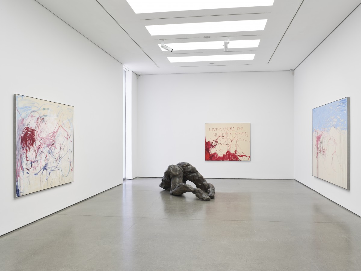
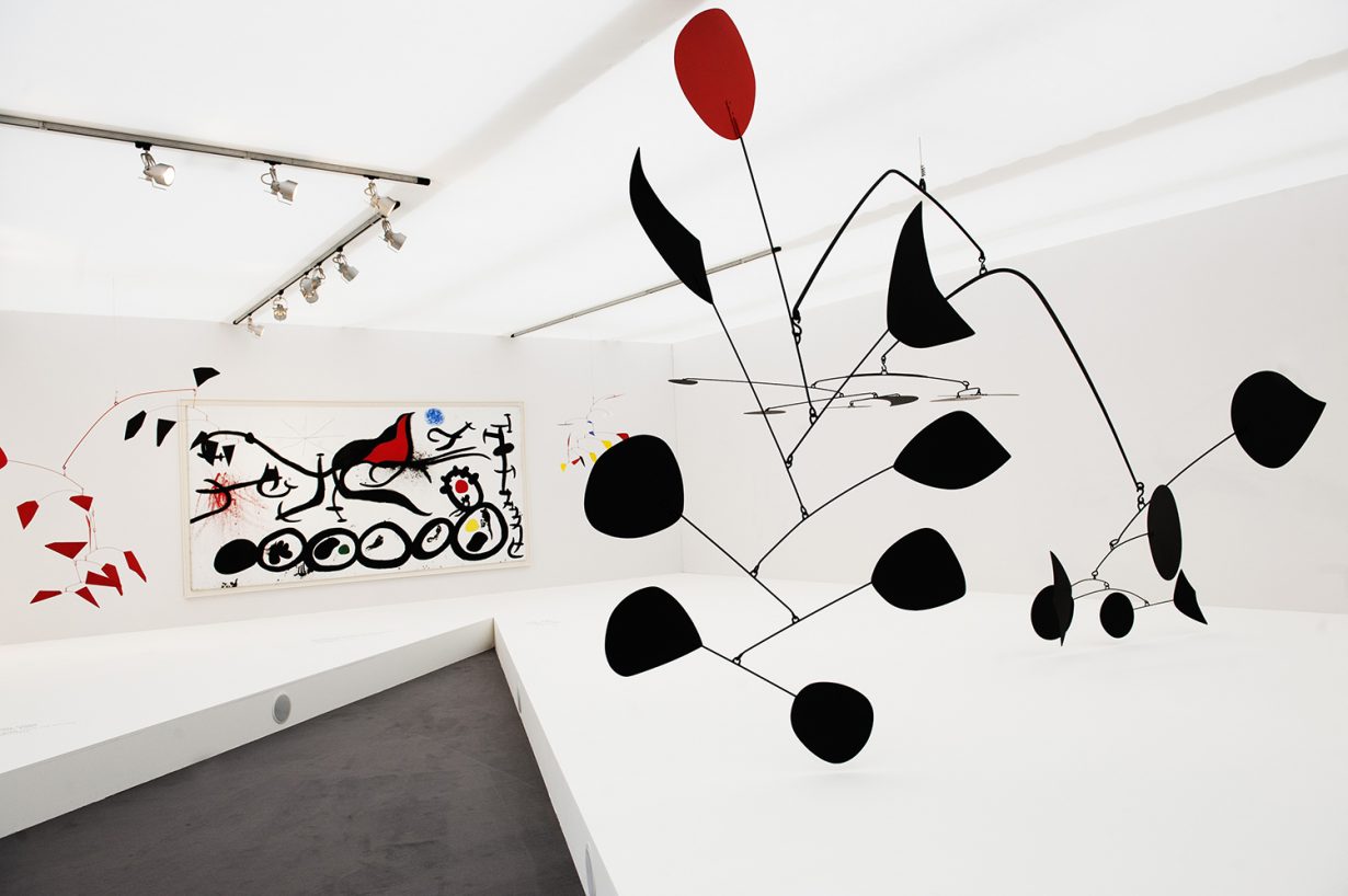
Am I now going to quote from Inside the White Cube? But of course. In his influential three-part essay from 1976, subtitled The Ideology of the Gallery Space, Brian O’Doherty argued that in these locations, something of ‘the sanctity of the church, the formality of the courtroom, the mystique of the experimental laboratory joins with chic design to produce a unique chamber of esthetics’. Time would appear to stop, and anything placed inside the magic box turns miraculously into art. Accordingly, the white cube recrudesces in more explicitly commercial viewing spaces: an art fair booth is a three-sided, ceiling-less variant bathetically infected with noise and visual interference; even when an online viewing room is constituted of one ‘wall’, it is inevitably white. If the white cube has never been truly ‘neutral’ – as O’Doherty describes it, it is intentionally coercive – then it is also not, or is no longer, a space in which the infrastructure and imbalances of the artworld conveniently fade out.

Often, when I’m able to set foot in a gallery these days, clean white space feels like the ground to runaway commerce’s ritzy, phantasmic figure. Against a pristine void, just about any artwork will be more likely to look worth buying – and, OK, worth looking at – than against the paint-smeared backdrops of an artist’s studio. This is also a reminder of the artworld’s structural conservatism, its silent safeness. To borrow the argot of internet critics, the white cube is a ‘locked-in’ format that almost every gallerist adheres to and validates, and if they don’t like it they can’t change anything without looking frivolous. Occasionally the artist calls for a different wall colour (and the press release apportions blame); sometimes the space is blacked-out for video, but then it’s time to make the shop look like a shop again. If the still-applicable lesson of Minimalism is that the art experience is the artwork plus where it’s presented, then white space is, thanks to shifting semiotics, now outwardly antiseptic, inwardly septic.
You might call this reading hysterical and touchy; maybe so. People who don’t come from money and don’t earn a huge amount of it can end up having allergic reactions when considering what’s happened to the artworld lately, and while basic jealousy is likely involved, so is disappointment. Consciously or not, a bunch of people of my generation – edge-of-the-playground-dwellers who then discovered the shreds of a workable ‘indie’ or DIY culture and thought this might still be a plausible space to inhabit – oriented ourselves towards contemporary art during the early 1990s because other options looked conservative, careerist, or inaccessible to right-brained types. Later we discovered that the playground was still there and that the popular and/or rich kids wanted the edges too, coveting intellectual glamour and, well, edginess, plus recognising an inbuilt class system that was easy to leverage. When art merged with high-end lifestyle they, or their parents, could buy said cultural credibility, mantle themselves with it: pay the art-school tuition fees, set up a space, land a gadabout gallery directorship, etc. Of course, money has always sloshed around the art scene – many canonical British modernists had cut-glass accents – but for a long time it wasn’t anything like the point.

In 2003, the year of the first Frieze Art Fair, the Norwegian record label Rune Grammofon put out a compilation whose title sticks in my head: Money Will Ruin Everything. You couldn’t exactly call that phrase a prophecy – its sentiment is as old as the Bible – but the future-simple tense ghosts everything that follows. Relatedly, it’s hard to see a future in which white-walled gallery spaces, real or virtual, aren’t the norm because they invest the art objects being made today with desirability, and the mercantile motive appears to control developments (or the lack of them) in the artworld. Not that this is entirely new: around a decade and a half before an Old Etonian named a London gallery after his book, O’Doherty wrote that ‘For many of us, the gallery space still gives off negative vibrations when we wander in. Esthetics are turned into a kind of social elitism – the gallery space is exclusive. Isolated in plots of space, what is on display looks a bit like valuable scarce goods, jewelry, or silver: esthetics are turned into commerce – the gallery space is expensive.’ He’d go on, however, to argue that the gallery space finally subsumed commerce (hence the necessity for a lengthy unpacking of its machinations). Nowadays, arguably, the opposite is true. The white cube will fade out when or if art itself changes enough to demand it, and meanwhile one may glimpse a silver lining in its persistence: in advertising complicity in today’s messed-up, herd-mentality market, every fresh coat of white paint is a subtle act of autocritique.
