On entering an exhibition of recent work by Michael E. Smith, you might be forgiven for not instantly noticing where that work is. Indeed, your first impression is of overwhelming emptiness. Then you might notice a folded sweatshirt perched on something that looks like (and is) a wasp’s nest, covered in some sort of silver plasticky goop so that it also suggests a broken or partially melted engine part.
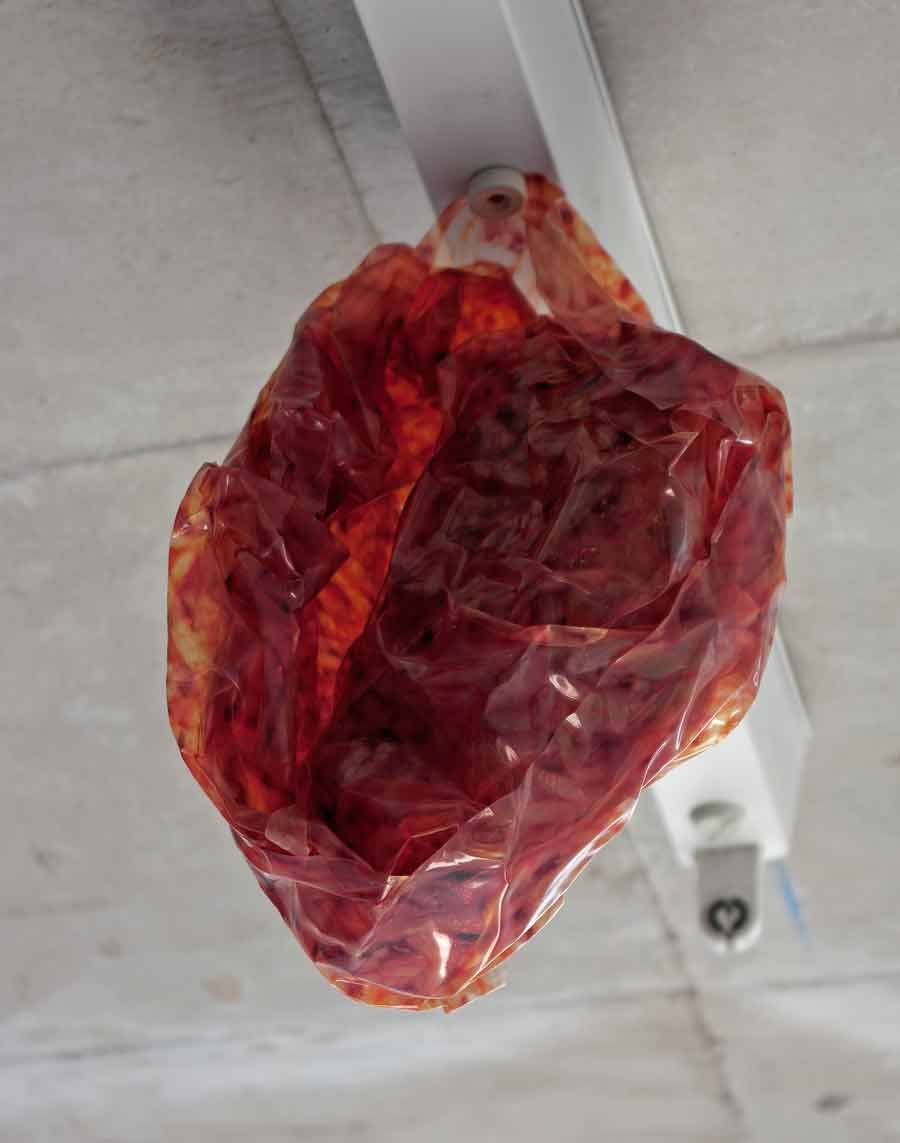
The largely empty gallery setting does not elevate this object, but instead exaggerates its seemingly pathetic and lonely status. Nearby you might come across a mixing bowl over which someone has stretched a white T-shirt. It seems at once empty and obese. For all that something is present (much to your relief), something also seems absent: the body the T-shirt was designed to house, the contents of the mixing bowl. And then there’s what looks like a crumpled plastic bag that might once have contained butcher’s offal or medical waste (actually the effect, in Meat Wad, 2013, is created using translucent printed vinyl) hanging from a tubeless strip-light fitting on the gallery’s ceiling. Now you realise that there’s not much in the way of lighting here. But perhaps this goes with an overall impression that’s more one of bafflement than illumination. Then again, that might be because in recent years you’ve been conditioned to expect art galleries to deliver big, dramatic artistic statements. Even when they involve a certain minimalist aesthetic.
The overall feeling of this exhibition, which took place at Berlin’s KOW last year, is of staring at the kind of urban detritus that might have washed up on some nearby beach, having previously suffocated some passing wildlife (definitely the sensation when staring at Tucan Sam, 2013, a bundle of coloured feathers balled up in plastic sheeting, the whole attached to the gallery wall), and that’s now waiting to be examined and catalogued by a team of environmental activists as evidence for their next campaign. Not that Smith insists on that last part. Life’s flotsam isn’t necessarily its pollution. Sometimes it’s the basis for an archaeological study of our ruined times.
Environment is key to Smith’s work in more ways than one. For example, some works, such as Untitled (2013), which features a car’s front seat mounted like a severed head on a windowsill, might conjure the plight of the artist’s native city, Detroit (and a postrecessional state of being more generally). Others, such as Mike (2013), evoke famous American chickens that had long lives despite losing their heads and the coincidence of the artist and his American gallerists (the Michaels Clifton and Benevento) sharing a name. (See? It’s not all doom and gloom.) But most important, given the way Smith currently treats a gallery space, you have to look for his work before you can look at it. And then wonder what it’s doing there at all. And it’s this ability to build up a viewer’s state of consciousness, while simultaneously forcing him or her to look at the traces of a breakdown, which makes his work so special.
Originally published in the March 2014 FutureGreats issue, in association with EFG International
