The fourth Dragon Hill X ArtReview Writers Residency text takes the seeming ubiquity of the colour pink (if in fact it is a colour) in the South of France as the departure point for a discussion of its ever-shifting qualities and interpretations
From the moment I arrived in the South of France – or, really, while still on the inbound flight – pink permeated my sense of being. The sunset exploded over the Alps through the airplane window and continued to do so every night from the residency’s perch high on a hill. It’s that specific kind of coastal sunset that meets the mountains, where the melting orb of the sun magically bleeds its reds, pinks, oranges and yellows through clouds and over hilltops. But pink was everywhere, not just in the sky. It was in the rocks and leaves when I went running and hiking; the background colour of the cover of a book I received in the mail; the beach umbrellas, tables, upholstery and decor at the first restaurant I went to, where even the bathrooms were pink marble. And once I noticed pink’s omnipresence, I caught myself searching for it even where it wasn’t. I saw it in Matisse’s reds, Miró’s (white) marbles, the bricks of Fondation Maeght’s iconic building by architect Josep Lluís Sert.
As the colour dominated my experience of the world, an interview I once did with Pamela Rosenkranz echoed in my mind: pink does not technically exist, she implied. Pink, she said, “is a mental performance”. Indeed, pink is not part of the visible light spectrum, with red on one end, violet on other, and orange, yellow, green, blue and indigo in between. Pink should, in theory, exist when the two ends meet, but a spectrum is after all a spectrum, not a loop, and they never converge; our brains thus conjure hues that we perceive as pinks (and some purples). In other words, pink exists in our interior world of perception – and thus as a colour, for colour is about visual perception – but pink does not exist in the exterior world. Its existence is our brains doing what they do best: playing tricks.
In her work Rosenkranz has frequently used pink to represent flesh, which reflects the earliest use of the colour in Western painting: to render Caucasian skin. Pink was used for this purpose, as well as in some religious paintings, until the mid-1700s, when the Rococo movement developed in France. Pink hadn’t even entered the English language as a noun or adjective until the seventeenth and eighteenth centuries respectively; before then, ‘pinking’ was slang to indicate stabbing someone with a sharp blade. But under the spell of the extravagance and sensuality of the Rococo, artists like François Boucher, Jean-Antoine Watteau and Jean-Honoré Fragonard (who was from a family of perfumers in Grasse, only a 20-minute drive from the residency) depicted their subjects in sumptuous pink garments and other pink accessories. At the same time, the colour also came into favour with Madame de Pompadour – a member of the French royal court and official chief mistress of King Louis XV – whose influence spread across the country, so much so that Sèvres, a leading porcelain manufacturer, even named a shade of pink after her.

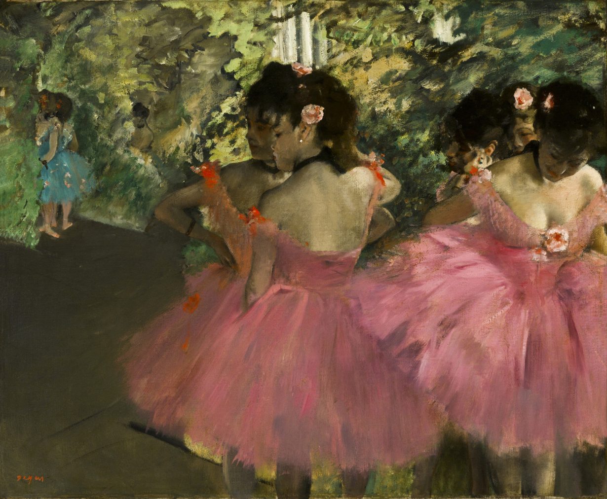
The colour continued to permeate Impressionist and Postimpressionist works over the next century. Degas’s pink dancers, Monet’s pink-saturated ponds and poplars, Gauguin’s pink beaches and forest floors come to mind. When Fauvism took hold during the early 1900s in the South of France, the colour was everywhere. Beyond pink’s appearance in a vast majority of André Derain’s or Matisse’s paintings, Matisse also created a chapel in the village of Vence, which I visited during my stay at Dragon Hill; here, his stained-glass windows drench the space in blues, greens and yellows, but at least three sets of the vestments he also designed were in silky pink fabrics, placing the colour on the priest in the centre of the chapel. At the same time as the Fauvists were boldly experimenting with nonnaturalistic colours, Picasso had his Pink Period, also known as the Rose Period, from 1904 to 1906, while living in Paris. But post-First World War pink’s presence declined, with the colour nearly entirely absent in the canons of Surrealism, Dadaism and Abstract Expressionism. Perhaps it is no coincidence that at the same time these movements developed, the colour was being coopted by the marketplace: until around the 1930s, pink had been a gender-neutral colour that often symbolised strength and was equally appealing to and befitting for men and women; but by the 50s, it had been marketed and firmly established as a feminine colour, an association that became ever more entrenched culturally throughout the twentieth- and twenty-first centuries.
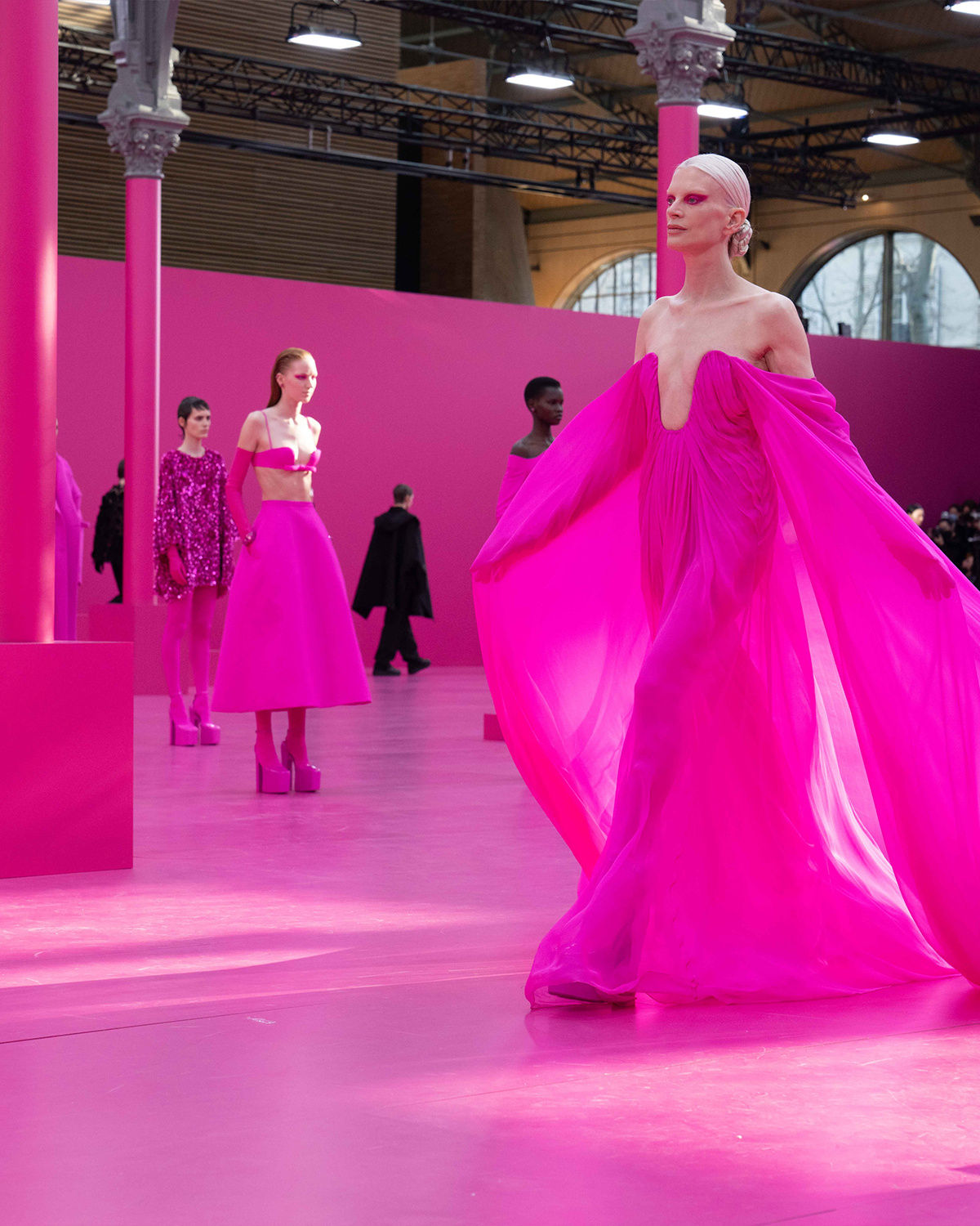
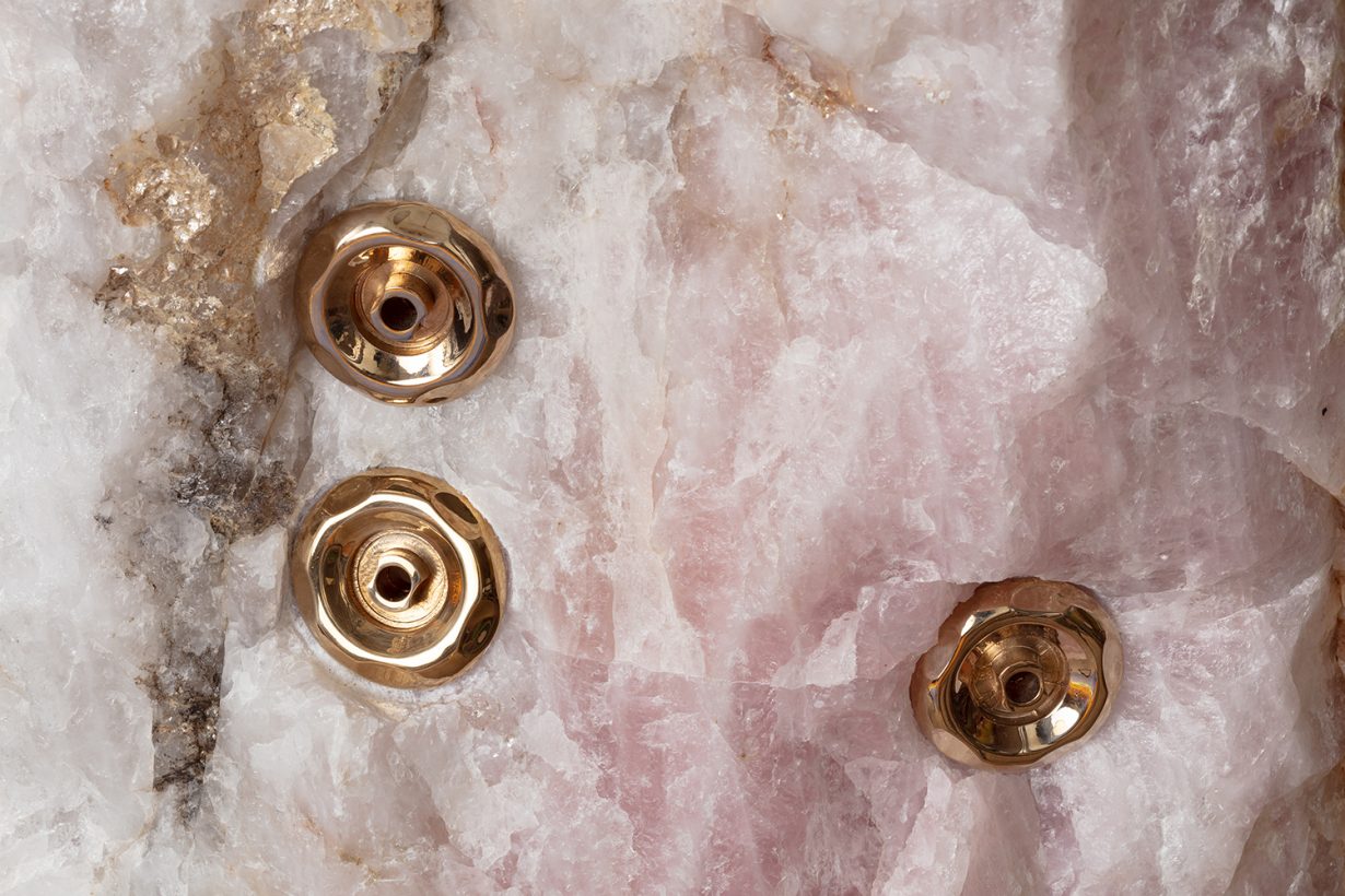
By the early aughts, pink was an integral part of aesthetically expressing hyperfemininity, a term coined by sociologist Jeanette Hoorn in 1990 to describe the exaggerated display of traditional feminine traits. Paris Hilton, Lindsay Lohan and Britney Spears donned pink miniskirts, baby tees and Juicy Couture sweatsuits, but they were also subjects of a misogynistic tabloid gaze. They were labelled bimbos, and hyperfemininised pink then became synonymous with dumb and ditzy. In the past decade, however, pink’s gendered association has been countered and reneutralised, at least to a certain degree, by the rise of millennial pink and rose quartz – named colour of the year by Pantone in 2016 – in fashion, interior design and other cultural spheres. And this paved the way for what we’re seeing today: the reemergence of an empowered hyperfeminine aesthetic and the reclamation of pink as an inherent part thereof. Dazed named 2023 ‘the year of girl’, with Taylor Swift’s Eras Tour, Barbiecore and ‘girl dinner’ front and centre, followed by a very brat (and pink) summer. This also shifts the framing of hyperfemininity from its associations with womanhood in the aughts to something more closely related to girlhood, perhaps using the innocence and playfulness of youth to override the sexualised associations of adulthood. This of course comes with its own set of issues (infantilisation to name just one), but at least it also means that in 2024 the fun, frilly, sparkling pink world of hyperfemininity welcomes anyone who wants to be a girlie.

I’d like to say that the development of contemporary art has mirrored this cultural evolution, reneutralising pink and then allowing anyone to embrace the colour in full, no strings attached. But it hasn’t. After speaking with the artists at the residency, querying Instagram and texting a slew of other artists and friends in the artworld to ask about their thoughts on the colour, it became clear that male-identifying artists generally seem to like the colour for its calming qualities (see: Baker-Miller Pink, but that’s another story for another time) and use it often without thinking twice about the choice. Female-identifying artists, however, said they felt using pink is either a taboo or a distinctly feminist gesture – that or a sign of naivety. The artist Gretta Louw summed it up best: “Pink is a catch-22 for female artists,” she told me. “You either have to define your whole practice around a central void of trying to escape this categorisation or double down and do it as a political statement.”
When I queried the internet – whether friends and colleagues on WhatsApp and iMessage, followers on Instagram, or ChatGPT – about artists using pink today in nonfeminist ways, the replies pointed to almost entirely male examples: Erwin Wurm, Takashi Murakami, Josh Sperling, Andrés Reisinger, Richard Mosse, among many others. Broadly looking at the decades between the feminisation of pink during the 1950s and its cultural reneutralisation circa 2015, I find that the artists who immediately come to mind are equally male: Philip Guston, Andy Warhol, Paul Thek, Dan Flavin, again to name just a few. Meanwhile, female artists employing pink in the same timeframe – Louise Bourgeois, Pipilotti Rist, Yayoi Kusama, Sylvie Fleury – have had their work read through a feminist lens, not necessarily because it is the subject of the work but because of their choice of colour.

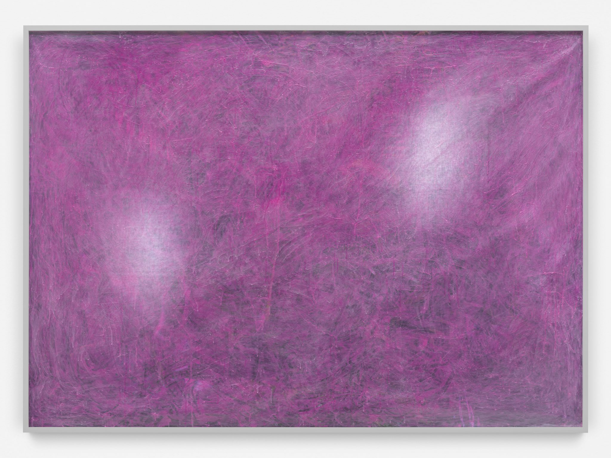
Artists such as Rosenkranz or Mika Tajima seem to be two of very few exceptions to the rule. They use pink in an almost scientific way that has, amazingly, largely eschewed feminist readings. Interestingly, though, when researching Rosenkranz, it occurred to me that neither she nor her galleries ever use the word pink: in texts approved by the artist, the colour is referred to as ‘“Caucasian” skin tones’ and ‘fleshy hues’, or in even more roundabout ways, such as referencing an unnamed complementary colour to a specific shade of green. Only viewers – and writers, admittedly myself included – add the word pink. Perhaps she’s not an exception to the rule; she seems to have carefully designed the verbiage used to describe her practice to avoid the taboo.
As I write this, an artist sends me a gallery’s post on Instagram. There are two images showing details of two paintings with pink tones. The caption references October being breast cancer awareness month and explains that the gallery is therefore showcasing female artists and works with a ‘beautiful pink dominance’. The paintings pictured have absolutely nothing to do with breast cancer; nothing to do, at least on a superficial aesthetic level, with femininity. But the artist is a woman and using pink paint, so duh! Her paintings must be statements about femininity – and thus also related to breast cancer! Once you’re aware of it, examples like this pop up everywhere, whether you’re looking for them or not.
For the four weeks of my residency, all of this and more simmered in my mind, my brain rewiring itself to think pink, with the colour guiding my perceptions and experiences as well as prompting new conversations and thoughts. Reflecting on it all, I’m left wondering how the artworld could reach a point where pink, like the cultural shift towards a general acceptance of the colour and the hyperfeminine aesthetic as just that – a colour and an aesthetic, not a statement – might be used freely by anyone who wants to, no feminist strings attached. Perhaps we need to stop looking for pink where it isn’t. Perhaps we’re seeing pink where it doesn’t exist. Maybe pink is just pastel red.
Emily McDermott is a writer and editor living in Berlin
