Judith Lauand’s work could be suffocated by the dry language of art history. The 30 oil, ink and gouache paintings on paper and card shown in this decade-spanning overview have a seductive, visceral immediacy for the viewer; one that easily gets lost as the critic addresses their concurrent status as art-historical documents.
The facts nonetheless are these: Lauand, now ninety-one, was among the first band of Brazilian artists to embrace Concretism. Concrete art was espoused by Theo van Doesburg during the 1930s and introduced to Latin America by Max Bill via his 1950 exhibition at the Museu de Arte de São Paulo, and Lauand was part of Grupo Ruptura (the only female member, alongside the likes of Geraldo de Barros and Luiz Sacilotto), whose rejection of figuration or symbolism in their work was directly influenced by the import. Her work, of which the paintings in this show are typical, exhibits an internal logic to the forms and patterning depicted – they are ‘constructed entirely from purely plastic elements, that is to say planes and colours’, as van Doesburg defined Concrete art. While at first glance the works in this show seem to share a sensibility of automation that typified much of the work by those artists – Lygia Pape and Waldemar Cordeiro among them – who identified themselves as working within Concrete art in this period, when seen up close, they clearly reveal individual brushstrokes; in Lauand’s case the author is still present in the works. Concreto 151, Acervo 195 and Concreto 143, Acervo 194 (both 1959), for example, are made up of, respectively, repeated, alternatively orientated L-shapes and triangles, but each shape is ever so slightly unique. A wavering hand here, an inexact angle there.
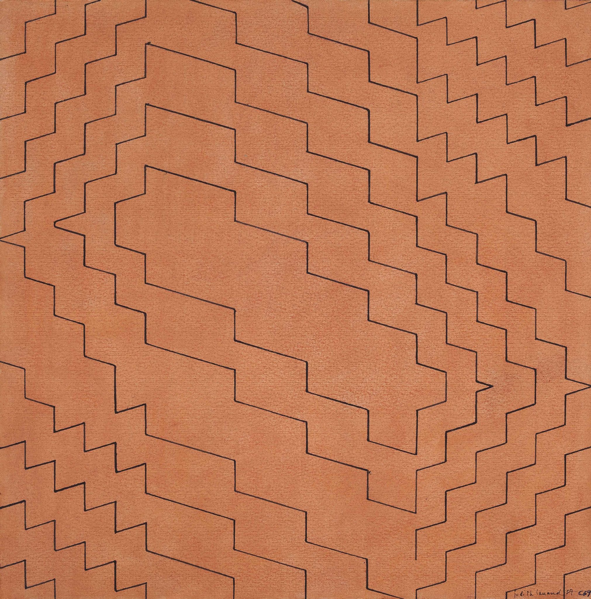
Lauand does share the sense of postwar optimism that epitomised work from the avant- garde made during this decade, and it’s a sanguinity that still resonates, right through to the modern viewer. It can be found in Concreto 69, Acervo 201 (1957), which has a warm orange background, ink- penned onto which is a jagged, oscillating circuit, which in turn is housed within a similar circuit, and so on, until it seemingly radiates off the edges of the paper. It is abstract, but undoubtedly there is some notion of energy present in the forms – of something explosive, something exciting, rippling out from the epicentre. Untitled (1955), a turquoise, blocky, weblike composition on black painted board, contains a similar urgency within its aesthetic.
The second of the two gallery spaces is given over almost exclusively to works made with black ink on plain paper. Less vividly coloured, these works nonetheless share a formal lineage in their use of straight lines and abstract, free- floating, shapes. They have the appearance of technical or scientific drawings, though the repeated use of diamonds and triangles could summon spiritual connotations.
The paintings work independently of the hard historical facts. They have an enjoyably expressive mode to them that, across the decades, still invigorates the contemporary viewer through a self-referential, playful celebration of colour and formalism.
This article was first published in the April 2013 issue.