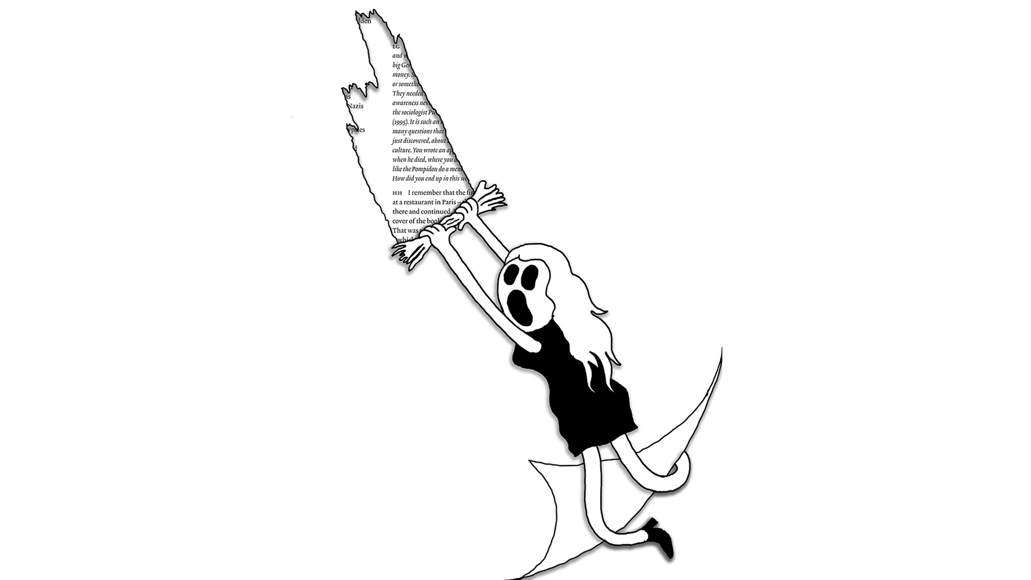
What are reviews and why do we produce them? Why do we value some things more than others? Can anything be reviewed? Four critics from around the world re-view the review
Contemporary life is cushioned in evaluation: suggested routes to walk or drive, which products work best, where to eat, what to watch or listen to. Inundated by product reviews on social media, for every transaction constantly asked to ‘leave a review!’
Reviews offer a way to navigate the overwhelming stuff of the world. Because it’s so big and so vast and so full of stuff to engage with or look at that no one could possibly cope with it on their own.
Broadly speaking, ArtReview was founded, 75 years ago, to deal with much the same problem. In relation to the world of art. Its purpose, back then, was both to record the breadth and variety of art exhibitions being staged, in venues ranging from purpose-built galleries and museums, to pubs and private homes, in London (which, for a little while, constituted the ‘artworld’ as far as ArtReview was concerned), and to tell its readers which ones were worth the trouble of schelpping through the bombed-out capital to see in the flesh. There was also a side-gig in tracking the ‘new’ (after all the idea, post-Second World War, was that a new world was being built out of the ashes of the old), punctuated by the odd reminder that the old (long-dead painters such as John Constable) was still great and shouldn’t be chucked out with the rest of the rubble. The main point, perhaps, was that culture was as essential to the construction of a new society as anything else. That still needs to be argued for today.
The art review has acquired its own purview of the terrain; often published after an exhibition has come and gone, not offering so much an assessment of how you spend your time or money as an attempt at offering up implications: how you might be inspired or ignited, and why. Though in today’s world, of aggregate reviews and entertaining influencers, the job of the art critic is often mistaken to be the job of simply amplifying the art. Which, in the age of celebrities and influencers, more often than not, means the voice of the artist. In short, there’s some confusion about what a review is supposed to do. Given that that’s ArtReview’s name, it thought that it might be useful to offer some insights into what a review can be. In the interests of establishing something of a personality behind the name. Or making itself more interesting than its name might suggest. That’s what everyone else does every day, after all. And ArtReview is nothing else but a person of the people, just like everyone else.
What are reviews and why do we produce them? Why do we value some things more than others? In the interest of finding out, ArtReview asked its contributors to re-view the review, with a series of case studies in what reviews can do, and in looking beyond their usual subjects and habits. In a sense, what follows pushes against the constraints of the review. Whether a comprehensive trawl of Mexico City’s San Miguel Chapultepec neighbourhood, reviewing everything within a half-kilometre radius; repeated looking at a solo show in Berlin of Maja Ruznik’s paintings, again and again to see if anything changes from one reviewing session to the next; reviewing a rural Brazilian rodeo, examining something that you wouldn’t necessarily call art, but might be more popular, more engaging and more relevant than art; or in Tokyo it’s to look at the role of the review itself and how cultural difference may determine differing reviewing etiquettes. What the review can be is still a matter to be endlessly critiqued. The point, perhaps, is to make you think about reviews as more open systems, full of potential. And perhaps you’ll look at the usual reviews section differently after that.
Case Study 1: Mexico City (the posh bit)
Gaby Cepeda
I usually avoid the San Miguel Chapultepec neighbourhood of Mexico City. Not for any particular reason; but because it’s not so easily accessible via my preferred form of public transport. One recent morning, however, I was at Mari Gold, an over-hyped ‘Indo-Mexa’ breakfast-lunch spot right in the middle of an area crawling with contemporary art galleries. The food was fine, I guess – papaya with pistachios is always a good choice, but the sopes with minilla were more like Tostito-sized snacks for the price of what a whole meal would have been in a humbler spot a few blocks over. It’s my fault for straying from my usual stomping grounds and into an area ruled by two types of establishment: Frida-Coyoacán-kitsch or greige-minimalist-overpriced. For that, there was no one else to blame but myself. Afterwards, I got on with my assignment for the day: to look at every single art gallery, good or bad, within a half-kilometre radius of kurimanzutto, the apparent centre of the CDMX art universe. I had picked the area precisely because I don’t frequent it, only work can drag me here, and I was anxious about what I would find: if some of the best-known galleries are here; so are some of those you might politely describe as ‘fillers’.
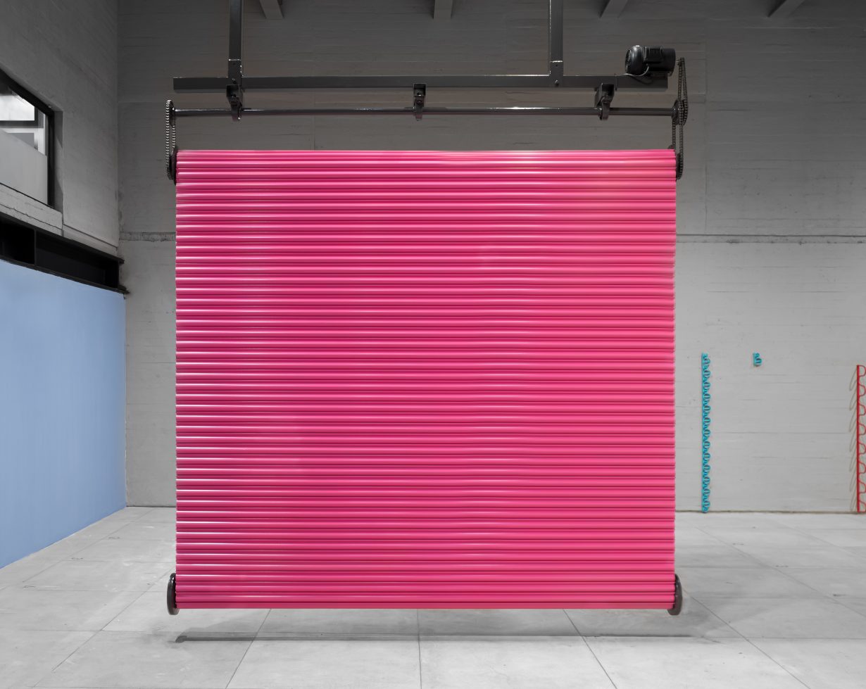
My first stop was RGR, a very serious looking gallery in a corner building that it seemed to occupy in its entirety. I had been here before, I think I saw some Carlos Cruz-Diez ‘chromointerferent’ Op-art pieces recently? This time, the gallery was showing O Vento Experimenta o que irá fazer com sua liberdade (The Wind Experiments With What It Will Do With Its Freedom) by Brazilian Marcelo Cidade, which was a nice surprise. Ansiosa ansiedade (Anxious Anxiety, 2024), the central work, was his take on a kinetic sculpture, a Barbie-pink garage bay-door cyclically rolling down and then back up with characteristic noisiness. Sitting in a corner was Resíduo privado de um corpo laboral explotado (Private Residue from an Exploited Labor Force, 2024), an object that is omnipresent in the crevices of my beautiful city: a plastic Coca-Cola bottle filled with a suspicious yellow liquid, a pithy gesture that cleverly encapsulated Cidade’s gift for the aesthetic observation of the urban environment.
My second stop, at Le Laboratoire, materialised every fear and prejudice I have about San Miguel galleries and the real reason I evade them: extraneous formal experiments, mostly by men of a certain age. It was an indecipherable four-person group show; a veritable snoozefest. ‘Stuff’ was everywhere: the best looking was 7 Islas (7 Islands, 2007), geography-inspired cowhide floor-sculptures by Gabriela Gutiérrez Ovalle; then there was Árbol y Escorpión (Tree and Scorpion, 2024), six ugly chunks of wood encrusted with vinyl-record chips by Guillermo Santamarina; and also a lot of Carlos Aguirre’s minimalist, black canvases completed by metal rods coming off the wall, from the series Extensiones y tensiones espaciales desde el plano pictórico (Spatial Extensions and Tensions from the Pictorial Plane, 2024). There were so many more works, I simply do not have the stamina to keep on describing. Naturally, this mish-mash of art objects was crowded under the title Archipiélagos (Archipelagoes), force-fitting a Glissant quote under pretexts so vague, so slippery, that I really thought: ‘What did he ever do to you?’
Also a little cramped was Galería de Arte Mexicano (GAM), a historical locale once run by legendary gallerist Inés Amor: Rivera, Toledo, Siqueiros, Tamayo and Carrington are still on its roster. They were showing Structure? by British sculptor Luke Hart. Chain-Link Twist III: Half Ellipse (2024) consisted of 21 sizable carbon-steel beams held together by interconnected orange clamps. The sequence was arranged dynamically, the two ends lying on the floor so that the middle section fanned haphazardly, in precarious equilibrium. Bar Arrangement I (2024) performed a similar trick but with less beams and in more chaotic angles. It felt slightly redundant, especially since the pieces were far too big for the space and one could never get a wide, unobstructed view of them to admire their industrially produced simplicity. An excessive amount of text on the poster-sized handout also drowned the otherwise straightforward work.
Nevertheless, undaunted, I kept going and dropped by Patricia Conde Galería, dedicated to contemporary Mexican photography. It was showing Crecí a la sombra de los árboles (I Grew Up in the Trees’ Shadow), dozens of small-format prints by Cristina Kahlo (yes, great-niece of). I will only say that most of them looked like what the bigwig at a publisher who underestimates women readers would pick as the cover of the new Elena Ferrante novel. A couple blocks down, I tried to visit Lizbeth Mitty’s painting show at Adhesivo Contemporary but the door was locked and no one was there to open it. There was a dark hued triptych that looked intriguing from the other side of their glass doors.
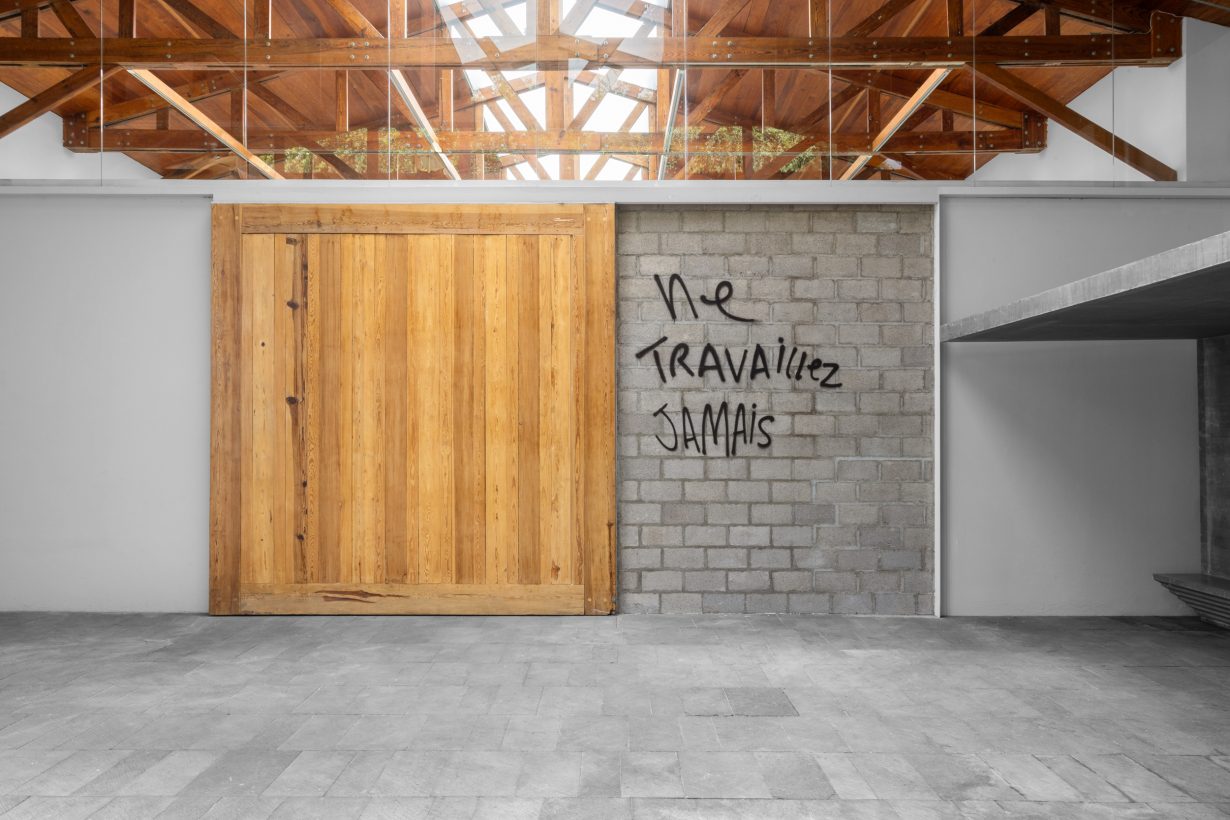
After that I strolled to Galería Enrique Guerrero, a spot that also enjoyed a sparkly moment in the early 2000s, back when they showed Teresa Margolles, Guillermo Kuitca and Julian Schnabel. Nowadays… well, I haven’t really visited in a while, but I was pleasantly surprised by Peruvian Jimena Chávez Delion’s show Aferrarse a los márgenes (Hanging on to the Margins). Hers is kind of a post-Post-Internet, readymade-ish sculptural exercise that leaves behind that movement’s cynicism to opt for a more regionally empathetic critique. A highlight was Montaña (2024), a Jenga-like tower of white sneaker-soles rising to a few meters in height. It imitated the way migrant workers pile the many bootleg sneaker soles they hand-paint daily in Lima, the artist’s home city, for sale in its many markets dedicated to ‘piratería’. As documented in Chávez Delion’s charming video Despertar el pulso (Awakening the Pulse, 2023), many of those workers arrive from nearby provinces and neighbouring countries. The artist’s eye and tact when recording the women workers felt very refreshing, unlike so much of the current victimisation and dehumanisation of such people, which is, unfortunately, the prevailing image perpetuated by mass media.
I was particularly taken by the part when a young girl, while painting a sneaker sole, talks about her dream: to make enough money to go back to Venezuela and study fine art. Soon enough, I got to the crown jewels of San Miguel Chapultepec: Kurimanzutto and Labor. At Kuri there was an eponymous show by Danh Vo, his second in five years, which is quick return for a gallery representing the number of artists it does. It wasn’t as perfect as the 2019 Danh Vo, but it was pretty good. There was a wooden space-within-a-space holding up 47 framed lithographs of different closeups of Renaissance paintings, lightly overlaid with Fraktur type that read ‘lick me lick me’, which was also the title of the entire piece. The best was at the very end: Untitled (2024) was a graceful little setup that included a sleek Angelo Mangiarotti grey-stone console with some plants, flowers and animal bones. Hanging above it, a crumpled replica of an early 13 Colonies American flag veiling a tiny, almost completely invisible, sixteenth-century Flemish painting of a Madonna Lactans. Vo’s historical-conceptual games of hide-and-seek continue to be amusing, and I imagine the 47 small prints flew off the shelves.
In a nice full-circle moment for my tour, another Brazilian artist was showing at Labor: Raphaela Melsohn’s Cortando linha se faz espaço (Cutting Lines Makes Space). She too showed at RGR earlier this year, in their Después del edén (After Eden) group show, but this was her first solo show in the city. There were a lot of big ceramic pieces, quite beautiful, though maybe a little cramped – an ongoing trend, apparently. They were white and voluptuous, their curves had curves: textured, bearing the marking and smoothing patterns of the artist’s fingers, they huddled in a huglike formation (DE NOVO E DE NOVO PASSO MEUS DEDOS PARA CONSTRUIR LUGAR, Again and Again, I Trace with My Fingers to Create Space, 2024), laid about like intestines in a butcher shop (Nó, 2024), or stood up, alert, like organic periscopes (Tipping Point, 2024). The best part was the ‘cutters’: Cut #1 and #2 (2024), large, heavy steel walls, bisected in the middle and standing near the entrance and in the back like exaggerated space dividers. Delightfully, the walls gave in to one’s touch, they were meant to be swung on their axis, cutting into the space in different ways. They reminded me of Hart’s steel works at GAM, which simulated flexibility and possibility; Melsohn’s enacted this.
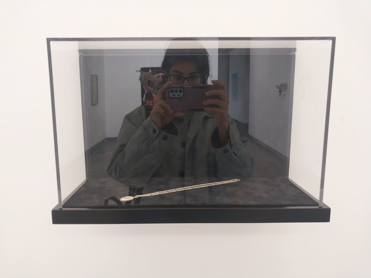
Anonymous Gallery gets an honorary mention. Circulación Espectral (Spectral Circulation) was a group show about money with works by well-known locals Paloma Contreras Lomas and Daniel Aguilar Ruvalcaba, along with a couple of foreigners, Ignacio Gatica from Chile and Adriana Martínez Barón from Colombia. Gatica had Preface for an Automated Stratosphere UMSCA (2024), one of his now recognisable LED-tickers processing financial information live; and Peregrinación Bursátil (México) (Stock Market Pilgrimage [Mexico], 2024), a lovely silver chain with a pendant in the style of the souvenirs from la Basilica de Guadalupe, but with the Mexican Stock Market Exchange building instead, exhibited inside a delicate vitrine. Martínez Barón had quite a few pieces, a favourite was her money-loving vitrine, Arco Iris (2015), an orderly rainbow of colours created by a thick roll of bills wrapped in an elastic band. She also had Prophecy (2024), a small and intricate origamilike sculpture of three birds standing atop of each other, made out of very pretty but worthless – because of dramatic devaluation – Venezuelan bills.
I believe this exhaustive art tour of the San Miguel Chapultepec area taught me two things: one, is that young South American artists are producing excellent work, and the local scene is finally catching up to them – surprising in a city that doesn’t show enough of our regional brethren, unless they’re living here and we personally like them. And two, is that aside from the last three galleries, which are on my usual rotation, maybe I should drop by some of the other ones sporadically as well. Maybe I should not judge the book by its cover (Instagram-posted documentation) every single time; perhaps I’ll turn the critique inwards and admit that I can afford to reexamine the preconceptions and habits I’ve fallen into after years on the local criticism beat. I will be brunching elsewhere though.
Case Study 2: My First Rodeo
Oliver Basciano
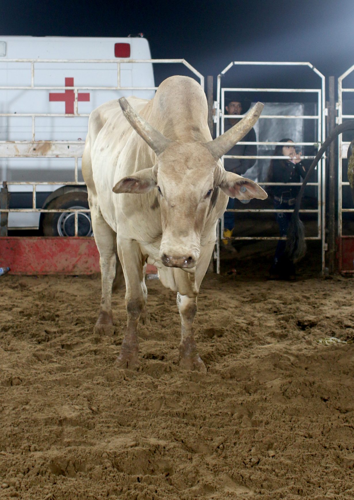
The track was pitch black and we only had the vaguest idea where we were heading. Still, the car’s headlights were picking out numerous people walking through the mud in the same direction. Then, round the bend, floodlights appeared; parking up, they illuminated a great metal cage around which thronged an eager crowd in jeans and Stetsons, clutching beer and pastel. The music started up: a high energy, unstoppable mix of song excerpts, no track lasting more than ten seconds before blasting into the next, or segueing into the frenetic commentary of the MC. This is the first rodeo of the season in my newly adopted hometown in the Brazilian state of Minas Gerais, far from the galleries and artist studios of São Paulo. This is the cultural fare available to me now.
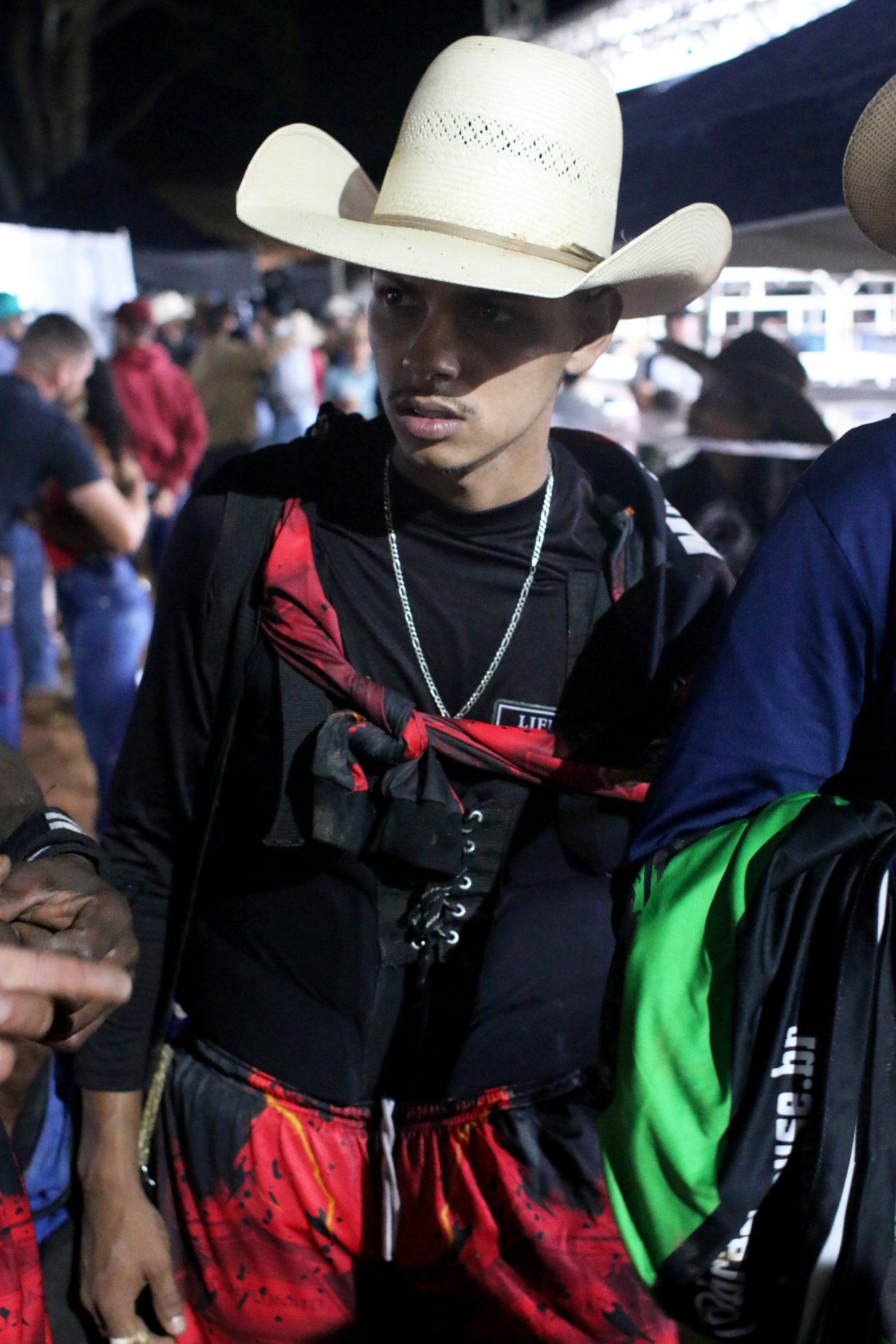
My friends and I got a beer and found the slightest of gaps in the crowd: the first rider was lowering himself onto a colossal bull behind a gate at the far side of the cage, the animal snorting and spitting as the young man wiggled himself into position. And then the gate swung open. The bull roared forth, back legs flicking up, a blur of muscle and sweaty fur as it twisted in circles. It ran full pelt towards us, a couple of metal bars between beast and our oblivion. The rider was good; a previous champion we later found out. The requisite eight seconds passed, and he was still on the bull’s back. 9, 10, 11, 12, thir- and he’s thrown into the air. The boy – and he really looked like just a boy – expertly rolls and lands a little distance away; he grabs his fallen hat and climbs the perimeter bars away from the bull’s lunges. The gate swings back open and the heaving animal bolts inside to its temporary stable.
The first night of the rodeo has a feverish energy to it: my neighbours and I are excited for the next few days. We will drink, there will be music, there will be hangovers that will be shaken off by doing the whole thing again. It struck me that this was a carbon copy of the rituals of the artworld I’d left behind: the fair-week excesses, the stamina needed for biennial openings. There is the slowly building momentum behind a particular rider that seems analogous to the whispers propelling a hotly tipped artist; except at the rodeo, opinion is less open to manipulation. The score sheet isn’t rigged as often happens the artworld, where gallery reps hype a new name until exhibition-goers begin to repeat it as if it were their own finely judged opinion.
For the rider, rodeo week is as high stakes as an art fair can be for an artist. The crowning champion will win a car or a sum of money equivalent to six months wages; the artist knows that a sellout booth will steady their career for a similar duration. There’s a uniform too: here, the linen suits of the art-fair crowd (or the gaudy wacky dress of the European biennial denizens) are replaced with jeans, boots and belt buckles. On hats, stickers proliferate: the Brazilian flag, the state flag, the Monster energy drink logo, cartoon cows and chilli peppers. These are the real markers of a ritual gathering: a bucking cow or the installation of art is just the excuse.
As the months drift by, the nature of the event changes, but the same sense of a community exercising its social bonds endures. During carnival the usually quiet central street erupts into an orgy of dancing and drinking, buses and Toyota pickups arriving from across the hills crammed with kids from neighbouring towns and villages (the tipple being horrifying pints of red wine and condensed milk). During the town’s saint’s festival, the church in the central square holds a service every night. If salvation wasn’t a big enough pull, a marquee is set up for bingo. Every night for a week, after the priest’s final blessing, the faithful and many more beside sit down for five hours of high-speed number-calling. I win an air fryer. There is a motocross rally in August (apparently only semilegal, but I spot the mayor of the town, currently up for reelection and keen to be seen, on a bike himself); there’s an ox parade in October (the cows, cute as they are, turn out not to be the highlight of the cow parade; rather it’s the wagons they pull, wooden carts, great sanded logs strung together with leather rope, intricately woven baskets atop); monthly night markets and the annual rodeo-queen contest.
Art has long since shifted beyond the object, entering what might be termed the experience economy: it has become a space of social performance that replicates the traditional community structure evident here. The bad collector buys a painting to go with the couch, the good collector is deemed so because she immerses herself in the network of the artworld (though she buys the same painting as her bad counterpart): the first day at the fair, the dinner, the museum patron’s event. Art creates relations that, unlike the rodeo or church bingo, are untethered from geography, their base only the presence of capital. The favourite bar of gallery weekend becomes the artworld’s town square, the queue to the restaurant outside the biennial the place of gossip and bonding. This dematerialisation of art – in which meaning, and a prevailing culture, is carved out by two-way discourse alone – was a fact recognised by the relational-aesthetics brigade during the 1990s, but that has since devoured the entire circuit. Art is no longer a sculpture or painting but a social mechanism. Performance programmes, parties, talk series: pity those who don’t want to play.
It took me a while not to imagine the fun my neighbours were having – gatherings that were initially strange and alien to me – through the secondary gaze of the seasoned gallerygoer. The rodeo looked like it might appear in some videowork I could have encountered. An interpretation label would have talked of masculinity and economics, it might have name-checked Donna Haraway as it made curatorial face-saving nods to animal ethics. The endurance of the bingo players feels akin to Doug Aitken’s obsession with auctioneers or something Rirkrit Tiravanija might have come up with to play out in a museum plaza as an ersatz spectacle of sociability (in the style of his ping-pong tournaments). Yet one tribal affiliation replaces another and when I did go back to the city, I found myself increasingly ambivalent to the noise around the art object. Can the artwork be read beyond the ritual that surrounds it, the one that shines its aura? Perhaps a topicality is lost, but beyond the noise, I’d argue, a certain clarity is born. High up in the mountains of Minas Gerais, where the rituals of community and culture are still tied to place, things feel less performed, less mediated and more personal.
Case Study 3: Groundhog Day
Martin Herbert
How many times do you typically visit a given exhibition? For people who aren’t critics, the answer is probably ‘once’. For those who are, it’s maybe twice or thereabouts, unless the show is uncommonly big. Then there’s looking: how long, how close? The late critic Dave Hickey reckoned you should be able to spend as long in an exhibition as it took to get there. Scaling up, T.J. Clark’s 2006 book The Sight of Death records the art historian’s daily returning, for months, to two Poussin landscapes in Los Angeles’s Getty Museum, and the granular revelations they disclosed under patient scrutiny. You don’t, though, typically find critics placing comparative temporal pressure on contemporary art. Is that down to the art, the writers, diminished or altered artistic ambitions, digitally broken attention spans, all the above?
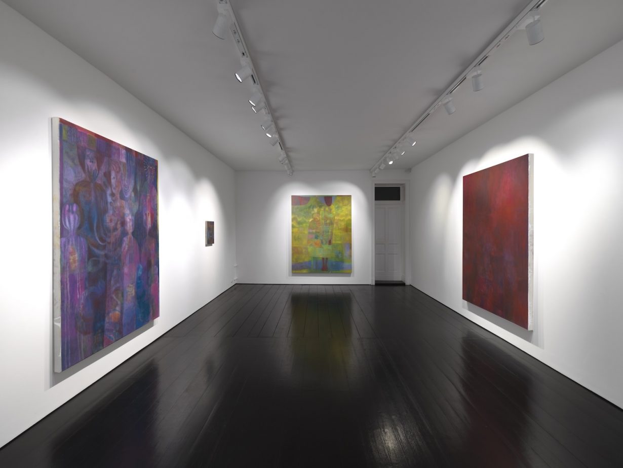
To begin finding out, I decided to keep revisiting one show until I couldn’t take anymore. I chose Maja Ruznic’s show at Contemporary Fine Arts, Berlin, because on a quick first visit during a gallery tour it seemed a useful test case: this one, I thought, might have hidden depths, or might not. (As a critic you need to be open to both possibilities.) The Bosnia-Herzegovina-born, New Mexico-based artist’s show comprised 14 figurative paintings with modernist overtones, bathed in a jewel-box palette: the kind of display where you walk in, your brain goes ‘ah yes, more figurative painting with modernist overtones, bathed in a jewel-box palette’, and maybe you move on, dimly aware that you haven’t given the work a chance, that you’ve barely seen it. So, I thought, let’s try to see it. Doing this, it turned out, involved almost as much unseeing as seeing.
Facing viewers upon entry was Azmira & Maja (2023–24), featuring an adult and child against a gauzy yellow-green landscape: I thought immediately of Arshile Gorky’s The Artist and His Mother (c. 1942), a double portrait, based on a 1912 photograph, of artist and parent staring plaintively out of the past, unaware of what life, and specifically the Armenian genocide, will do to them. (Checking later, Ruznic’s composition is substantially different, but the vibe – memory, displacement – is comparable.) Amid the interlocking composition of faces and profiles in the peach, pink and toothpaste green Sea People (2023–24), I hallucinated both Edvard Munch and vague 1970s memories of Eastern European cartoons on BBC2. Afore other canvases I wondered if the gallery was actively seeking to replace its ex-artist Tal R, whose work has a comparable spooky, sometimes cartoonish, art history-inflected vibe. Some smaller paintings skewed more abstract and decorative. That’s probably all I got in half-looking, half-scouting mode.
The next day I dutifully went back, while wondering if I should have chosen a gallery that isn’t on the far side of town. In morning light, Sea People was paler and glimmering, raking sunlight emphasising the interior glow caused by Ruznic’s signature stippling; its compositional structure, rippling both vertically and horizontally, was newly clear. Grandmother (2024), too, implied a figure in water: a hunched, almost cronelike woman inhabiting a multicoloured lake while fireworks of dots and lines erupt around her. Her face looks like a crosseyed lion’s and is marked by outwardly radiating lines that, I saw, repeat on the mother’s shield-shaped face in Azmira & Maja, an aspect that felt significant, inscrutable: ciphered. At this point, though, a gallerist appeared and, because I didn’t protest in time, gave me the spiel; illuminating, if narrowing, anecdotes tying art to life arrived.
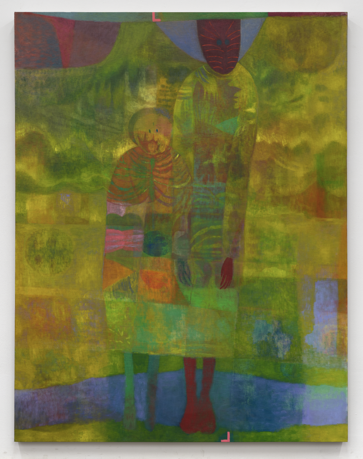
Ruznic and her mother, it turns out, fled the Bosnian war of the early 1990s when the artist was nine, displacing first to a refugee camp in Austria and later to the US. The double portrait is, indeed, of her and her mother, from a photo taken at the Austrian camp; its green colour scheme, Ruznic said in a recent interview, forever reminds her of Bosnia. Her grandmother, who stayed behind, died in 2017; Grandmother was apparently a deliberate attempt not to romanticise her. That Ruznic, of late, has gotten interested in shamanism meanwhile seemed germane to two paintings titled The Helpers (both 2023–24), which feature wraithlike figures in gravity-free space: in The Helpers II, keyed to deep greens and watery purples, a half-dozen facial profiles surround a female-looking figure with arms outstretched and a deadpan, cartoonish, frowny face; above her, a spreading light fitting or an inverted, long-haired figure’s head. Maybe Ruznic’s grandmother is in this halfway-consoling realm somewhere, maybe mine too.
One visit later, I approached a kind of spectatorial sweet spot: the stress-free pleasures of repetition offset by a low pulse of fresh discoveries and realignments. The pressed-together elongated figures in The Child’s Throat (2024) had initially felt offputtingly Klimt-indebted: pattern recognition in action again. But Ruznic’s askew mix of warm browns, verdant greens and lasers-in-the-jungle electric blue kept drawing me back into a progressively unnerving composition whose emotional fulcrum is a bent-backwards, big-headed, sacrificial child figure: a stabbing cipher of oblique pain, surrounded by gangly phantoms. Next time around, feeling familiar with the show’s broad strokes, I was gravitating towards its murkiest, least resolved elements: the dense, flickering purple otherworld of The Helpers (2023–4), into which the mother from Azmira & Maja now appeared to have crossed over; the scattering of smaller near-abstractions that punctuate the big canvases. After three visits and closer inspection, these little works still didn’t do much; Ruznic, I decided, was one of those painters who can’t scale down. I kept planting myself in front of the harlequin-patterned Cells (2024) with its nice harmonies of midnight blue, red and orange; it kept giving me mild, brushy tastefulness.
Time to stop doing this, my feet told my eyes. Parts of the show still didn’t quite jigsaw together beyond the past being only halfway accessible, the hope that our lost loved ones still hover, watching and supporting, in the ether, but the doubt itself felt emotionally true. Much more rote returning, though, and all this might boomerang into frustration. Meanwhile, a lesson learned, or relearned: the categorising eye and mind and the energy-conserving human organism want us off the hook of close looking, yet that’s where everything substantial about art viewing resides: pleasure, undoing, complication, judgment, surprise. I’d begun by putting a painter in a box: neomodernist, spiritualist space cadet, playing dress-up with lingeringly fashionable themes and aesthetics; I found, later, a sincere artist chasing vocabularies for bruising experiences. As it turned out, this show’s approach to articulation was right there in its title, Mutter: German for ‘mother’, English for saying something that requires effort to hear.
Case Study 4: Local Flavours
Thu-Huong Ha
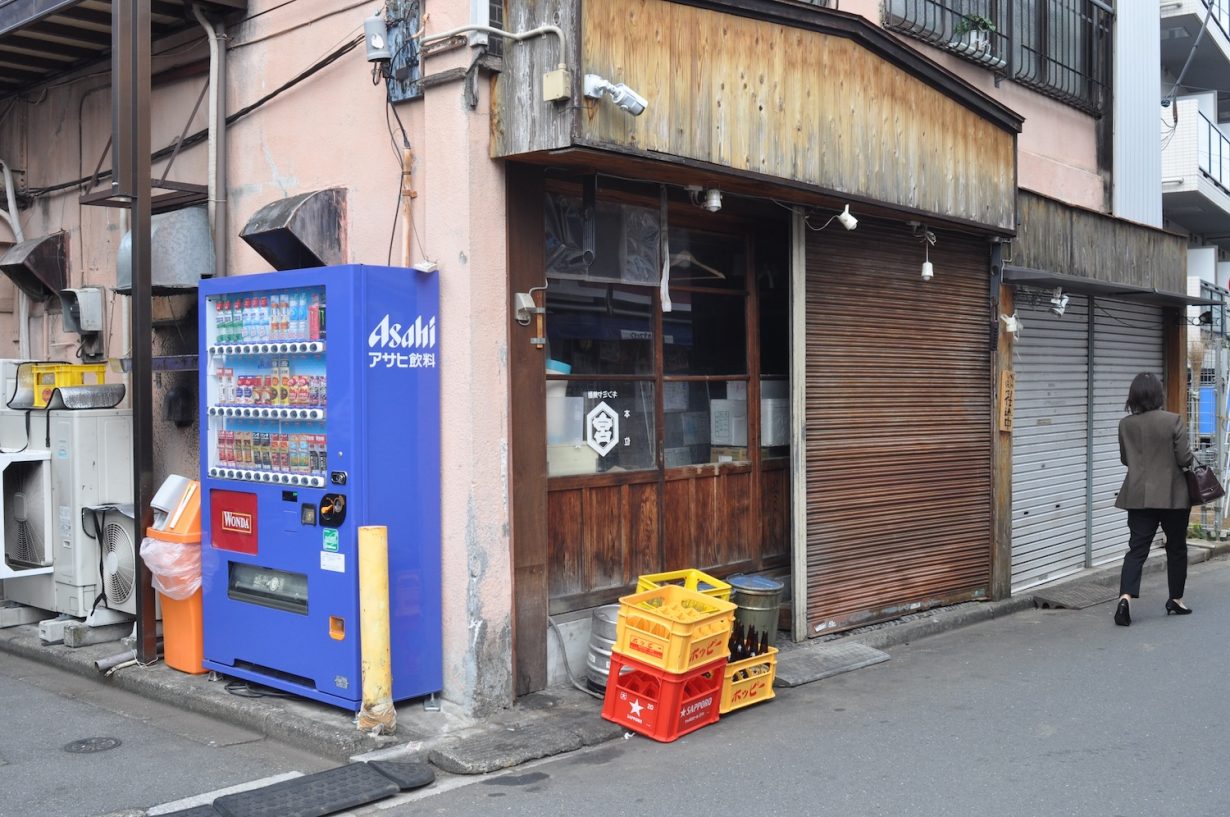
As an expat living in Tokyo, I’m expected to provide all kinds of local wisdom when friends (and cousins and former colleagues of former college friends) come to town. There are a number of rote tips I rattle off to well-meaning hipster tourists thirsty for some semblance of an ‘authentic’ experience in this city that’s been thoroughly picked over by influencers and vloggers, but there’s one that takes so much explanation that I sometimes hesitate to give it: never trust the Google reviews.
4.5 stars for conveyer belt sushi in Shibuya? Useless. 4.8 stars for a Tokyo station izakaya with an English menu? Better off just getting in a random line on the street.
This is not simply, as it may seem, a comment on the inferior tastes of tourists; it reflects a clash of review cultures. Japanese reviewers do not give 5 out of 5 stars for a service or establishment that is good. If it’s solid, it gets a 3. If it’s really good, it gets a 4. Nothing gets a 5. Japanese reviewers grade harshly on dimensions of service, cleanliness, ‘cosu pa’ or ‘cost performance’, the etiquette of other customers. At a soba shop near my house, low stars are given for the colour of the tempura (black), the smell (ammonia) and the presence of ashtrays (one for each table). On Tabelog, a Japanese Yelp for restaurants, if I see 3.49 stars, it gives me a little thrill. A typical review might read something like, ‘Food was super delicious. Perfect night. The server had messy hair. 2 stars.’ It’s why Shake Shack has 4.5 stars on Google and the best udon you’ve ever had in your life has 3.8: tourists love grade inflation.
For this Vietnamese–American raised on New York bagels and pizza, further nuances and dialects are required to interpret the language of local reviews. When I moved to my current apartment and needed to find a reliable neighborhood bakery, I looked askance at the mostly Japanese reviews on Google maps. The Japanese palate favours soft and bouncy fuwa fuwa textures – nobody is on the hunt for a crusty sourdough or a crackling baguette. (To my dismay, the search for good bread is still ongoing, six months later.) Similarly, Japanese spice tolerance has got to be one of the lowest in Asia, with employees trained to ask if customers are OK with wasabi, and whether they want their curry ‘spicy’ or ‘Japanese spicy’.
Our world of apps, algorithms and e-commerce is heavily saturated with user-generated reviews. Whether 5-star review culture symbolises the democratisation of taste or the demise of expertise, it’s too late to turn back to a time before everyone was a critic. But contending with bots, click farms, incentivised reviews, not to mention all those people – like me – who only leave reviews for excellent or awful experiences, how do we make sense of this abundance of text? When criticism is aggregated and flattened to a scale of five yellow stars, meaning breaks down.
Every platform has its own internal language and culture. A 2021 study found, for example, that Google Maps restaurant reviews are on average 0.7 stars higher than those on Yelp. Uber and other peer-to-peer rating systems are susceptible to what researchers call ‘reputation inflation’, in which users leave 5 stars by default and dock stars only when something has gone terribly wrong.
Meanwhile the review sections for books on Amazon and Goodreads have become hotbeds for cancel culture across the political spectrum, a place where users can quickly organise to bring down books and authors. In 2017, Amazon had to delete at least 900 fake reviews from people leaving one star for Hilary Clinton’s book about the 2016 US presidential election; it got so bad that later the company instated restrictions on select controversial items so that users couldn’t leave reviews at all without a verified purchase. In subsequent years YA novels deemed racist by early reviewers and social media critics were targeted with one-star ratings on Goodreads, and multiple titles have been pulled before they ever hit the shelves.
But as one becomes more fluent in any particular system, the culture reveals itself. No longer a tourist in Japan, I find a certain ethnographic delight in plumbing the depths of sub-review cultures that remain relatively homogenous, like neighbourhood pharmacies, laundromats and tailors. I read the user-generated reviews for a nearby funeral home and crematorium like I would an art show I’ll never see – and like the best criticism, it offers a kind of artwork unto itself.

You’d think the appraisals would be full of highly sensitive and emotional reactions to how beloved family members were treated after death. Yet here in the Google reviews for this funeral home, in this very specific sliver of internet, I find a surprising number of things at work: nationalism, pastoral nostalgia, budgetary concerns, hunger, pride, grief. There is of course the requisite ‘It’s very beautiful’ with a picture of a pretty decent looking teishoku set. (3 stars.) ‘It seemed like we were being rushed, like we should hurry up and do it quickly because we have so much to do, without immersing ourselves in the sadness.’ (1 star.) One reviewer is surprised that there is nowhere to get a drink and you have to use the vending machines outside. (1 star.) There are several complaints about the bones being handled directly by the hands of the staff without gloves, and how rushed it feels, compared to the countryside, where more care and patience are given to the ceremony. A lot of comments are about where the parking is, how much it costs, where the smoking section is, and how hard the roads are to navigate. A couple of reviewers use this opportunity to give screeds against the Chinese, as the for-profit funeral home has been reportedly bought by a Chinese parent company. A few mention that imperial family members and other celebrities have been cremated here.
It turns out, once we learn to search the sweep of stars with careful eyes, patterns and stories reveal themselves. One person is only in the Google reviews to say rest in peace to their best friend of half a century.
Hero image artwork by Walter Scott
