Logging onto a wireless network near Davide Balula’s wall-mounted sculpture Coloring the Wi-Fi (with Dark Green) (2015), you find yourself automatically redirected to a mysterious new address. The whole page is a monochrome dark cadmium-green. In the top left corner, words in small type identify your new location: ‘Davide Balula, Coloring a Wi-fi Network (with Dark Green), 2014’. In the context of this exhibition, the webpage offers the visitor practically the only glimpse of pigment in what would otherwise be an almost entirely black-and-white world. Significantly, even this colour exists only virtually, hovering in a locative netspace, at once inside and outside the gallery walls.
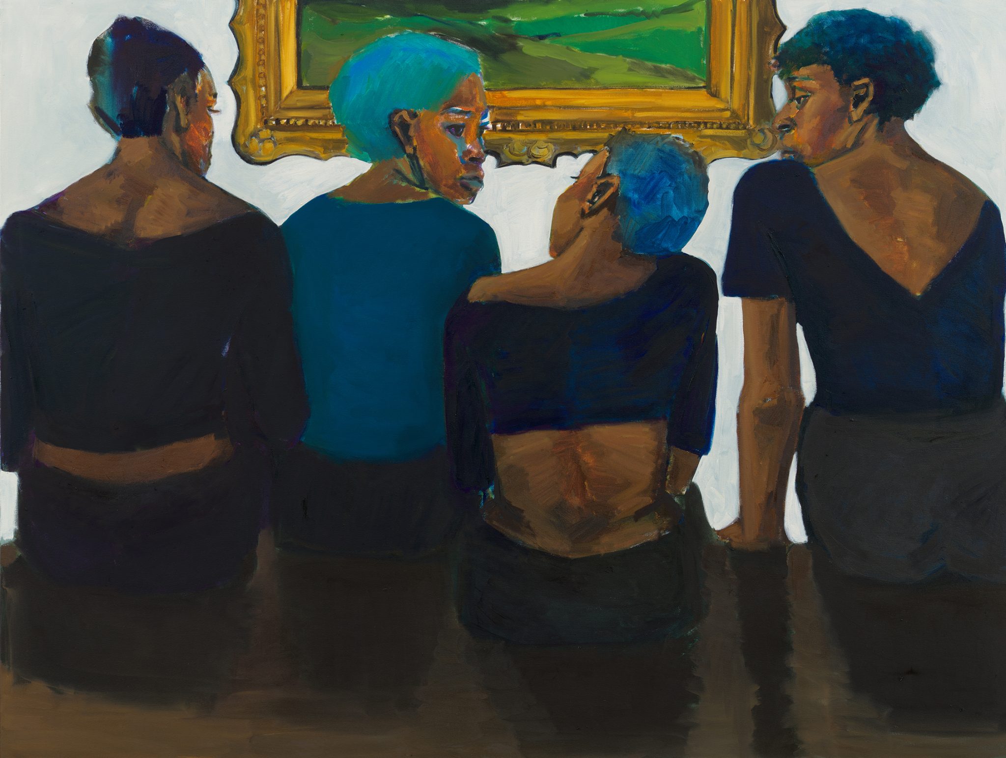
Taking its title from David Batchelor’s 2000 book of the same name, Chromophobia decks the white walls of Gagosian’s Geneva space with yet more white, along with the occasional shade of grey. ‘Since Antiquity,’ writes Batchelor, ‘colour has been systematically marginalized, reviled, diminished and degraded.’ This antipathy the Scottish artist and writer names ‘chromophobia’. Surveying the history of art and literature, he sees colour ‘routinely excluded from the higher concerns of the Mind’. When art looks to the very essence of things, it invariably does so in black-and-white.
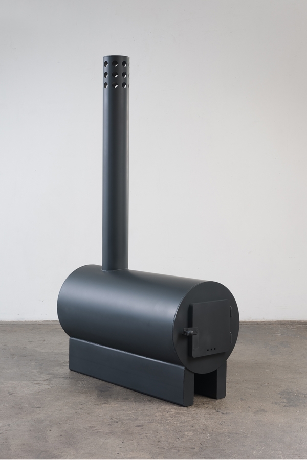
So here Sterling Ruby’s Stove 3 (2013) abstracts its subject to a series of simple shapes in all-matte black as if to grasp at the Platonic ideal of a stove, only reachable once purged of hue. Canvases by Dadamaino (Volume, 1959) and Wyatt Kahn (Eh-Em, 2012), each in their different ways, exhibit less their own painted surface (or in the latter case, unpainted surface) than the holes they delimit and encircle, gesturing towards some metaphysical void at the centre of the subject. And after all, what better defines that ‘pure… generalized white’ (for Batchelor, ‘essentially a Western problem’) than the cold, hard semiotic vacuum of gallery walls?
But in Robert Ryman’s Untitled, Bruxelles (1974), in which acrylic paint is applied to a black vinyl panel, a different kind of whiteness is broached. As Batchelor notes in the book, Ryman’s whites are ‘specific’: not pure, not abstract. They do not ‘involve or imply the suppression of colour’. Likewise, in Piero Manzoni’s Achrome (1958) we see less the whiteness of the canvas, more the folds across its centre, creating zones of shadow and impurity. Another work of Balula’s, Artificially Aged Painting (Wet, Dry, Wet, Dry, Wet Dry) (2014), with its cracked and yellowing surface, introduces corruption into the very white surface that has historically stood as a bulwark against the debasements of colour.
Against what he regards as the chromophobic colourlessness of much contemporary conceptual art, Batchelor trumpets an ‘impurism’ that draws on the ‘commercial and contingent’ tones of Pop and Minimalism, pushing them to a point of excess. Few contemporary artists represent this impurism better than Blair Thurman. The latticed neon of his Cool White Frame II (2015) takes a shape at once singular and loaded with personal meanings; its referent feels familiar but unplaceable, like something glimpsed in a dream. Like the remnants of a dream upon waking, the fluorescent tubes spill light onto the surrounding surfaces, adulterating the sheen of the gallery walls. In such ways, writes Batchelor, ‘the isolation of local colours is countered and put into reverse. Colour begins to regain its excessiveness.’
This article was first published in the April 2015 issue.