A pair of exhibitions – of Gene Beery and Lily van der Stokker – at Parker Gallery, Los Angeles are playful and nuanced while stalking the movements of previous years
Sidelining for the moment the magnetic force between these two shows, installed on different floors in a wonderful house in Los Feliz at the base of Griffith Park, anyone who has been paying attention to Parker’s programme of thoughtfully juxtaposed exhibitions might still have been surprised by a condensed survey of the work of Gene Beery. He has been hiding in plain sight ever since his years in New York during the late 1950s and early 1960s (where he was championed by Marcel Duchamp and Max Ernst), ending up in the Gold Rush town of Sutter Creek, California. As Lucy Lippard suggests in her new essay accompanying the exhibition, Dada might be the one movement he belongs to after the fact, apart from the ones he has ‘stalked and evaded over the years (expressionism, conceptualism, pop, folk)’. The earliest works here are dated ‘1960s’, a manner of identification that continues as the show reaches the ‘2010s’ – a sort of sly, spread-the-credit-and-the-blame methodology that anchors Beery’s entire enterprise, and which has everything to do with his ability to creep up on those movements mentioned above without getting caught.
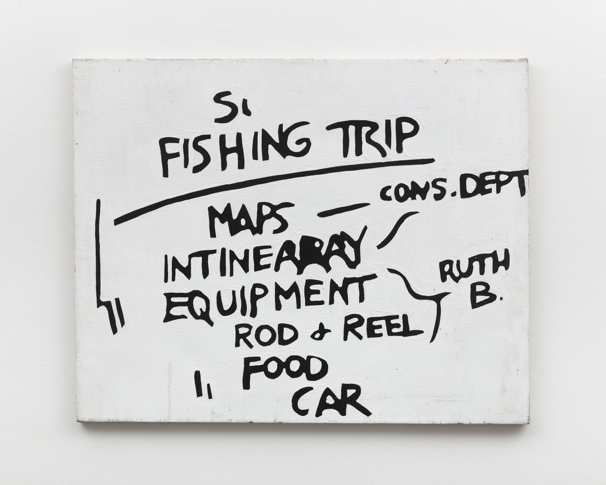
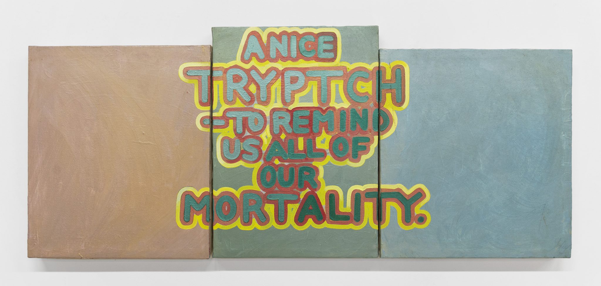
His key format, existing across the inspired variety of his work, is a small white canvas with scrawled black text in acrylic: starting with Fishing Trip (1960s), running through numerous works (predominantly from the ‘2000s’ and filling the show’s second room) and ending with Actual Size (2021), ten small canvases installed in two vertical rows and hung in the stairwell leading up to Lily van der Stokker’s show. Fishing Trip’s single canvas reads like a list one might put on the studio door to remind oneself of what to take when you’re going to escape (‘INTINEARAY [sic], ROD & REEL, FOOD, CAR’), and Actual Size repeats the punchline of its text on all ten panels, adding a literal ‘BANG’ to the last one. Away from these works it could seem unfathomable that such a simple procedure could span decades; standing with them, you think: how could it have been any other way? (I’m tempted to invoke On Kawara.) Other paintings incorporating colour and imagery reinforce Beery’s pictorial agility: for example, A Nice Triptych to Remind Us All of Our Mortality (1973), installed below a window overlooking the front yard so that we take it in not unlike an altar-shaped grave marker planted in the ground of the floor. Its panels are painted the colour of stones, its title is its epitaph, and it’s critical that it’s nice about reminding us of death’s inevitability.
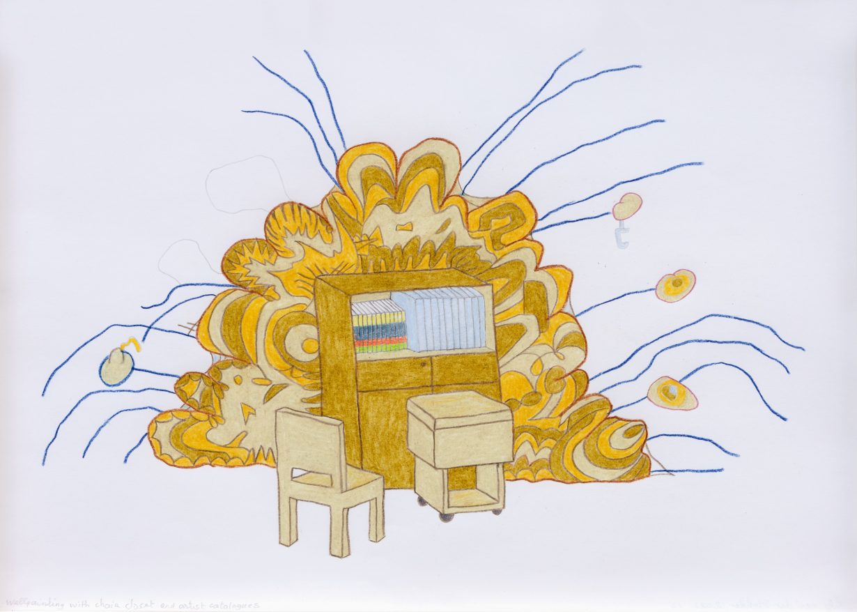
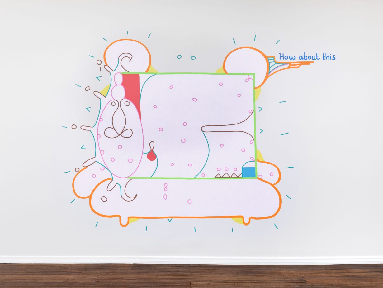
Van der Stokker has had mastery over her version of ‘nice’ from the beginning of her work; for all the apparent differences between their approaches, she’s not so unlike Beery. Represented here by a small selection, her work holds its own, and then some. Flanked by five small coloured-pencil designs for her signature wall paintings, the wall painting is called How About This (1996–2022). Ostensibly organised as a rectangular ‘frame’ around and over which bulbous oval painted shapes are attached while somehow remaining floating (the cartoonlike ‘motion lines’ around the perimeter of the entire wall work support this effect), the overall structure gives it the look of a playful yet totally productive organic machine (I’m channelling Duchamp’s ‘malic moulds’ here). Its candy-coloured linearity and shape-making, meanwhile, generate an art deco-y shelf in the upper right corner where part of the phrase of its title perches. Van der Stokker is one of only a few contemporary artists – John Wesley is another – capable of creating magic with colour, hues that can be vibrant and subdued all at once. The mystery of this contributes to the complex attitude of her work, a way of being that challenges cuteness without undercutting it, all the while reminding us that using the term ‘decorative’ as a pejorative may be a defence mechanism against the open-ended staying power it can have.
Van der Stokker and Beery both have utterly recognisable hands in the words and phrases they incorporate into their compositions, and these ‘looks’ extend to the hand that guides everything else in their work. To be clear, this doesn’t have much of anything to do with touch; instead, it’s the hand as a transmitter of thinking, particularly when the thinking is as simultaneously playful and nuanced as it is in the work of these artists.
Gene Beery, Portrait of the Artist as a Spandex Tuxedo; Lily van der Stokker, What is it at Parker Gallery, Los Angeles, through 29 October