William Daniels’s solo exhibition of paintings is almost too boring to write about. Apologies to those who work at the gallery and who support Daniels’s practice, but for all this talk about painting being ‘dead’, from Yve-Alain Bois to David Joselit and back, and about how it’s not very dead at all – look at how its most interesting examples veer into social networks, institutional critique, performance, etc – Daniels’s painting really is the deadest kind. It does nothing to update the medium in any interesting way, which means it merely holds wall space for rich people with antiquated taste.
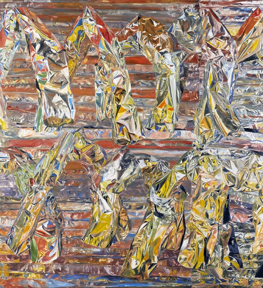
Hovering between figuration and abstraction, Daniels has created a series of oil paintings based on classical arches. Each painting features two foregrounded rows of them, one atop the other, and they veer slightly in space, as if floating. The backgrounds are a series of thin horizontal stripes. There are eight canvases in total, and with the exception of the very first in the series, Untitled (all works 2013), whose background/foreground relationship is a bit vague, all look more or less similar, the only slight differences being their colour and whether the foreground or background is emphasised.
In one, the arches are more pronounced. In another, it’s the background that pops. There’s nary a straight brushstroke in sight. Rather, each motif is composed of dozens of different but related colours, a technique somewhat akin to the refracted surfaces of Cubism, but more manic and less geometric. In one arch alone, red, blue and green fold into each other yet don’t compete. The dude’s got skill, that’s for sure. Too bad it’s employed to such redundant ends.
Maybe it’s a question of misplaced mediums. More interesting is the process Daniels uses to make the work. With an image or vague shape in mind, he forms almost sculptural tableaux out of tin foil (formerly, he used cardboard). Taking a picture of this scene, he then paints sections of the photographs onto board. The paintings are more interesting as JPEGS, where they appear very graphic; the canvases, in contrast, look flat. Photographs of his tin foil creations would be more alluring, as would the tin foil maquettes themselves, which raises the question of why Daniels is painting at all. Is it because he should, or is it because he can?
This review was first published in the October 2013 issue.