The function of brand imagery and logo design, we might assume, is to communicate the beneficial qualities of the product or brand as clearly, concisely and quickly as possible. Signification is intentional and ambiguity is avoided. So far, so semiotically uncomplicated – for design at least. On the other hand, as David Crow notes in his book Visible Signs: An Introduction to Semiotics (2007), contemporary art offers ‘many examples of work that deliberately seek to avoid what [Umberto] Eco calls “the laws of probability that govern common language”’, going on to reiterate Eco’s view that contemporary art ‘draws its value from this deviation from common structures’. Is this really the case? If so, Mick Peter’s exhibition wholly undermines some of the common (and for designers, infuriating) misconceptions around how art and design ‘make meaning’ in different ways.
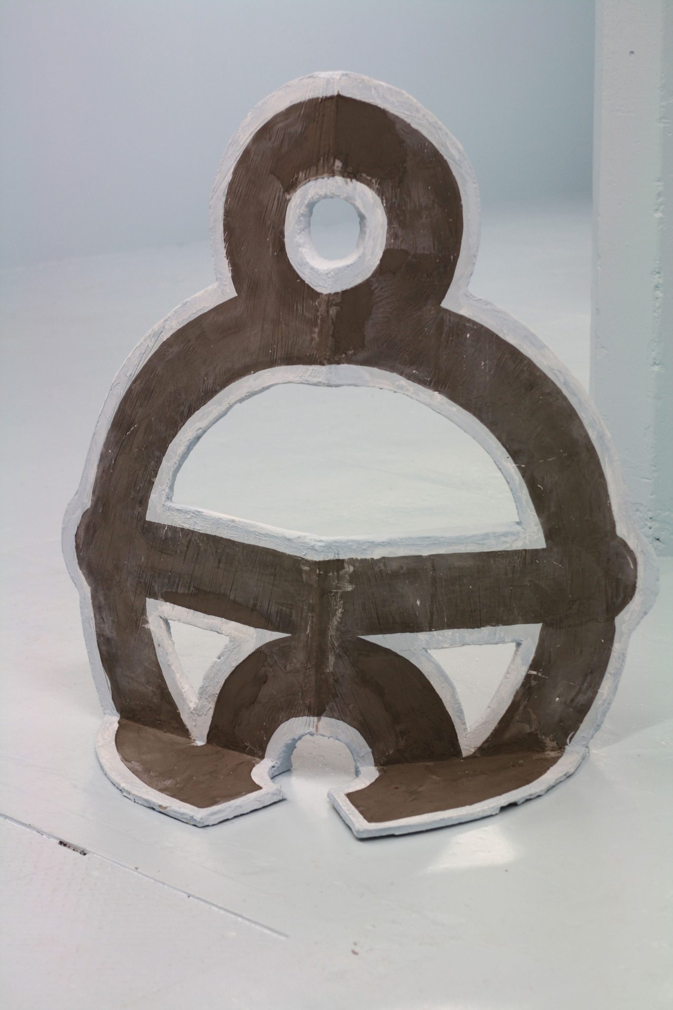
Continuing his interest in the world of commercial art – as seen in last year’s exhibition Lying and Liars at the Collective Gallery in Edinburgh – Peter has variously appropriated, translated, invented and adapted trademarks drawn from predigital eras of illustration. These form the catalyst for the five large sculptures in Trademark Horizon. The trademarks themselves, drawn from old Graphis annuals and other sources, are intriguing because of the abstract or idiosyncratic approach to the product or brand their designers aimed to encapsulate. Even before Peter’s intervention, the downright eccentricity of these ‘failed pictorial trademarks’ suggests that the anchor had already begun to become unmoored. Working with these signs, Peter has increased the detachment of the logos from their commercial application, focusing instead on the almost fantastical design processes that seemingly underpin them. This is clear in works such as Toot and Come In (all works 2013), a large-scale jesmonite and polyurethane foam sculpture based on a supermarket logo that featured the head of a pharaoh. What links an ancient Egyptian king and a mid-twentieth-century grocery store? And what are Thing Fish (beyond the title’s reference to Frank Zappa) and Book-Keeper selling? While the style here is midcentury modern, resembling the imagery of Robert Stewart’s textile and ceramic design, it also emphasises Peter’s interest in revisionist histories of art and design, the odd moments of madness or brilliance where art and design go completely off-kilter and veer into counterculture.
It is the apparent arbitrariness between form and function that lends humour and playfulness to both the original trademarks and logos, and to the artist’s treatment of them as almost animate objects or puppets. Set on a stagelike blue ground that sometimes appears to float above the bare concrete floor of the larger gallery space, the sculptures could be read as strange, lifesize chessmen about to perform in some kind of object theatre, or as monumental props in Jacques Tati’s Playtime (1967). It is this visual wit, verging on kitsch, which is perhaps Peter’s own trademark and the success of this show.
This article was first published in the Summer 2013 issue.