To mark the opening of M+, Hong Kong’s new museum of visual culture, ArtReview will select highlights from the museum’s collection as part of its ‘Work of the Week’ series. Stay tuned for a weekly focus on the background story of a single work and the network of associations it conjures
I first came across images of Tadanori Yokoo’s poster Made in Japan, Tadanori Yokoo, Having Reached A Climax At 29, I Was Dead in my late-twenties, having returned to college to pursue an education in graphic design. I didn’t understand it at all; but I sure liked it. It was one of those images of which I have been an enduring fan ever since. Years later, I came to live in Japan and to understand more deeply its multiple meanings.
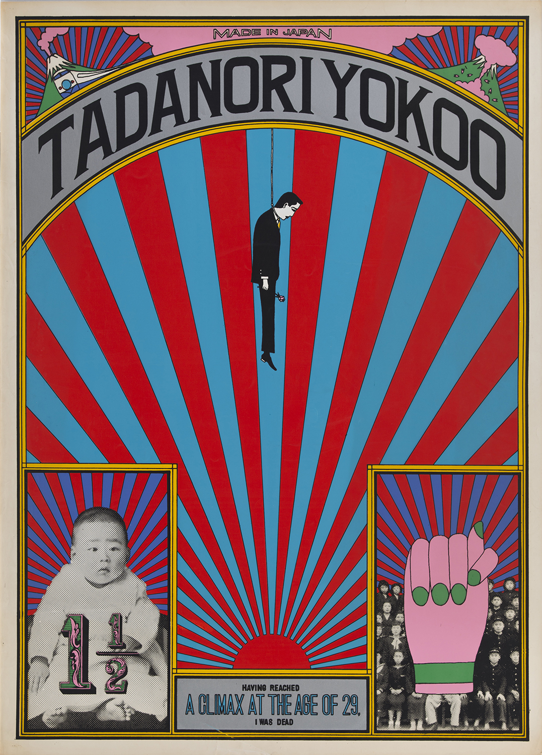
The work was created for and exhibited at the Ginza branch of the Matsuya department store as part of the graphic-design exhibition Persona in November 1965. Persona was the successor to Graphic ’55, the exhibition held in Tokyo a decade earlier that helped popularise the term ‘graphic design’ (‘グラフィックデザイン’) in mass culture in Japan and to introduce it as a sector of cultural production worthy of being admired in art galleries. Yokoo was one of 11 young designers at Persona who would help to define Japanese graphic design over the subsequent decades (five established veteran designers exhibited in their own section of the Persona show, as well). While nearly all of the work exhibited was relatively pragmatic in origin – calendars, magazine covers, and posters advertising pharmaceutical products, beer, whisky, motorcycles, stage productions and art exhibitions – Having Reached A Climax… stood out as being one of the only items in the exhibition that used a design format, yet was not in itself advertising or product design. As much as it did for its content and subject matter. The show was only up for six days, yet remains a landmark graphic design exhibition, both in Japan and globally.
The poster’s title, lettered at the bottom of the composition, is an acerbic reflection of the countercultural sentiments of Japanese youth of the time and their more general mistrust of postwar culture and politics. Yokoo himself was involved with the radical underground theater movement, designing posters and stage settings for assorted productions of one of its most avant-garde protagonists: Terayama Shūji. The radiating rising sun motif, both a symbol of wartime Japanese imperialism and an ornamental element from historic Japanese packaging design – notably on numerous matchboxes produced in the early 1900s – appears five separate times in the poster. Two visions of Mount Fuji, one of Japan’s iconic national symbols, are printed in its top corners: one of these shows the Tokaido Shinkansen bullet train, which had debuted the year prior, speeding past an erupting Fuji-san in a depiction of speed, modernity, and power; the other is shrouded in a Sakura-pink mushroom cloud, signifying the country’s very recent dystopian past. Another pink cloud is printed between the two mountains inside which sits the words ‘Made in Japan’.
Underneath the images of Mount Fuji, the designer’s name is inscribed in a historical American lettering style (similar to that found on Heinz ketchup labels) along a curved frame. From the centre of this dangles a morose illustration of Yokoo himself wearing a suit and tie, hanging from a noose with a rose in his hand. In the bottom corners of the poster are a photo of Yokoo at age one-and-a-half, and a teenage school photo overlaid with an illustration of a hand, its thumb clenched between the index and middle fingers – the symbol of lying in Japan, akin to crossed index and middle fingers in America and Europe. What I find endlessly fascinating about this poster, a visual obituary wreathed in sociopolitical critique, is that it also heralded Yokoo’s very public debut. His use of retro-historical graphic elements was a firm and highly ornamental rebuttal of other Japanese designers’ adoption of essentialist Bauhaus-inspired Western modernist methodologies, presenting here, a kind of ‘death’ of modernism.
The historical importance of Having Reached A Climax… lies in its disruption of entrenched Western design narratives that have traditionally claimed as their own the emergence of postmodern graphic design, while excluding the developments of modernism and postmodernism across the rest of the globe. Yokoo’s self-referential poster, which plays with contradiction, hybridity, and visual metaphor, stands as one of the earliest examples of the postmodern graphic design movement. Ultimately it suggests that Japanese design culture ‘Postmodernised’ prior to that of Europe and North America.
Tadanori Yokoo’s Made in Japan, Tadanori Yokoo, Having Reached A Climax At 29, I Was Dead (1965) can be viewed in the section ‘Anything Goes: Postmodern Design’ of Things, Spaces, Interactions at M+, Hong Kong, and via its online collection