Sometimes the artworld is booming, sometimes it finds itself in crisis. The current moment of uncertainty prompted ArtReview to go back to its archives, to look for other moments when, for better or worse, the times they seemed to be a-changin’, even if it couldn’t always work out how, or why.
In this second pick from its archive ArtReview goes back to the Britain of 1951. Six years after the end of the Second World War, and with reconstruction and renewal on everyone’s minds (not least those of modern art and design critics) a young Peter Reyner-Banham has started writing about design for Art News and Review (as ArtReview was then known). In his column ‘The Shape of Things’ Reyner-Banham shares his enthusiasm for new developments in graphic design, industrial design and architecture. Here, he discusses how that most enduring of British institutions – the Pub – is being reinvented by a new wave of design thinking…
THE SHAPE OF THINGS: “… Take Courage”, by Peter Reyner-Banham, Art News and Review, Volume 2 no. 26, January 1951
The old adage tells us “There’s no bad beer,” but does not exclude the possibility of a better beer. Somewhere, no doubt, there is a parallel proverb about beer-bottles, or even beer-houses – the possibility of betterment is not ruled out. The Arts and Crafts movement, indeed, had great hopes of the country pub, in which it saw, in its tweedy way, the last embers of that imaginary mediaeval glow at which it warmed itself for so many years. But there is no profit from fuelling imaginary fires; only synthetic tudor facades, conscientious quaintness, and tin “lanthorns” from which, in the throes of a gay social evening, one is liable to receive nasty cuts and abrasions.
Alcoholics Unanimous have, in fact, exhibited considerable solidarity in facing the problem of the Machine Age pub ; most designers have regarded the bar as such a stronghold of conservatism that nothing can be done about it, a large faction have maintained that nothing ought to be done about, and the customers took the view that the main business was to drink the stuff, not to argue about the way it was packed. Nevertheless, good design is persuasive and pervasive, and was bound, sooner or later, as it invaded one field of life after another, to arrive at the door with Public Bar engraved on its window.
Good design is persuasive and pervasive, and was bound, sooner or later, as it invaded one field of life after another, to arrive at the door with Public Bar engraved on its window
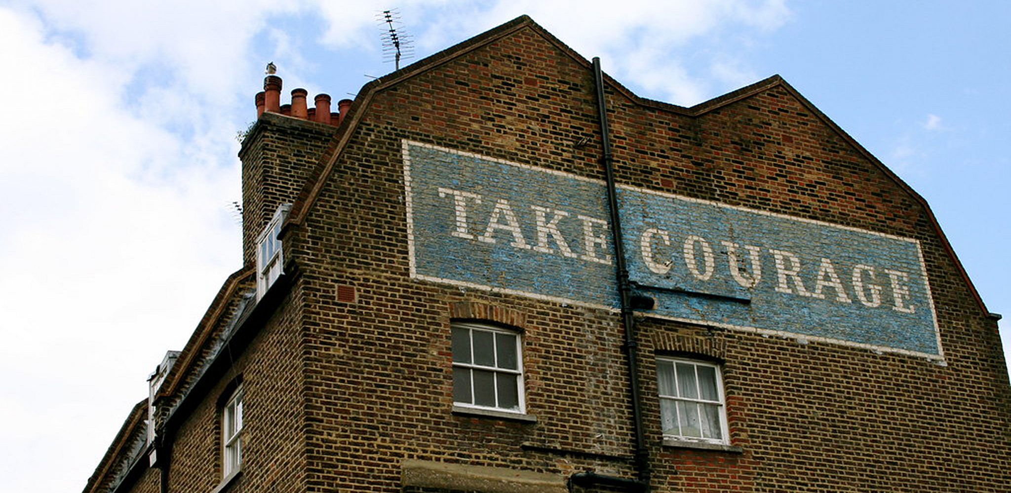
It arrived there in strength a few months ago for a major frontal attack on the whole problem, but the results of this effort – the Architectural Review Pub Design Competition – will not be really apparent until there is more building of public houses. In existing conditions this was something of an academic exercise, and was such a radical assault that it rallied all the reactionary columnists and academic pundits (most of whom had not seen the prizewinning designs) to the defence of the visual squalor they seem to hold so dear. A modest beginning, right under the customer’s nose, was required, and has, in fact, been undertaken – wherever one sees a game-cock exhorting the public to “Take Courage!”
The Courage re-design campaign has begun at the bottom, with drip-mats, and will work up to bigger things in due course. Its greatest achievement is already accomplished, one suspects, in the reform and standardization of the Courage symbol lettering, and certain items of pub equipment, for here the designer, Milner Gray, of Design Research Unit, has done work which could hardly be bettered in the rest of the campaign. It is in the field of lettering that some of the worst disasters have overtaken the English pub, and where the Arts and Crafts movement has been least beneficial for design. Its demand that all letter forms should betray a calligraphic origin, has induced a Manichaean attitude to display alphabets, and has given us, on one hand, typefaces of hypocritical purity (and feebleness) and, on the other hand, a feeling that display faces were so disreputable anyhow that anything would do if it could induce some kind of visual shock.
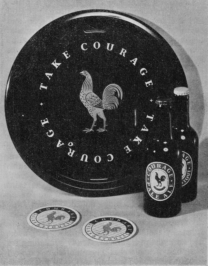
Yet the brewers of England are the heritors of a great tradition (beside the one they enthuse over so fulsomely on hoardings and in the coloured magazines) – a tradition of lettering which includes some of the most attractive, yet forceful, display faces ever devised. These sensible letters with romantic names – Antique Shaded, Grotesque, Narrow Gothic, Fat Face, Egyptian – are bold, emphatic types with little or no decoration about them, and yet they can have a most decorative effect when employed with cunning and discrimination. The new Courage typeface makes an intelligent compromise between the elegance of Eric Gill’s Perpetua, which the letter forms resemble somewhat, and the blunt, no-nonsense quality of the traditional “Egyptians”, and the way in which it is employed by Milner Gray on the tray which is illustrated here, is a salutary demonstration of the art of being decorative without using decoration. Not even the two little stars are purely decorative since they serve as punctuation between the two slogans. The cockerel has a real and important function, as a trademark, and the function of the slogans is obvious, but no one can say that this is an example of that “Spiritual barren-ness” that is supposed to be a quality of Functionalism. This is an extremely attractive design, and its decorative qualities come from a just blend of cunning and discrimination – in the ratio of letter-size to intervening space, in the choice of the right degree of formalization in the rendering of the cockerel, and in the placing and proportion of the parts in relation to one another and the contrasting tone of the tray.
It seems that a new era of visual pleasure is just around the corner of the bar
The complete Courage campaign will eventually involve the redesign of all the details of equipment which are needed in the running of the pub; an enormous undertaking which has special problems of its own. What, for instance, is the right balance of tradition and innovation, and of diversity and standardization. In this last matter, the designer’s approach has been to enforce one standard lettering alphabet everywhere, and to allow some diversity in other things. The Courage fighting-cock is as distinctive as the Bass triangle, but more adaptable, for it remains a cockerel whether it is presented in full naturalistic detail, or as a simple silhouette. This, diversity in unity guarantees that the “regimentation of pleasure” whose imminent arrival is so often proclaimed, is not yet to be, so far as the pub is concerned.
Instead, it seems that a new era of visual pleasure is just around the corner of the bar. It is an era which we have awaited a long time now, one in which those numerous and interesting crafts – glass founding and glass engraving, cooperage, pottery, furnishing, lighting, signwriting and so forth – crafts which long, and short, tradition associate with the art of refreshment, will come together to produce a public house with a new look which is as satisfying and inviting as the old.
This article first appeared in Art News and Review, Volume 2 no. 26, January 1951